Manual Maintastic V19

As at: 04.03.2026

Contents

1. Introduction of the software Maintastic

Maintastic is the AI-driven CMMS (Computerized Maintenance Management System) designed for collaborative asset care.

The system is the go-to choice for mobile-first teams and transforms how maintenance work is organized, executed, and documented. It puts everything maintenance professionals need right at their fingertips. With its intuitive mobile app for day-to-day operations, Maintastic enables teams to ensure machine availability and stay productive.

Whether capturing issues, managing assets and tickets, creating work orders, providing checklists and instructions for standard operating procedures (SOPs), or collaborating with machine suppliers via video and chat – Maintastic brings clarity, consistency, and efficiency to every task.

The CMMS unlocks the full potential of both reactive and preventive maintenance. Technicians can report and resolve problems quickly thanks to AI-powered ticketing, while teams gain visibility into recurring activities and inspection routines to ensure nothing falls through the cracks. This dual approach helps organizations maintain control, reduce costly downtime, and keep operations running smoothly.
By combining artificial intelligence with human expertise, Maintastic empowers maintenance teams to work smarter, collaborate better, and stay ready for the challenges of tomorrow.

2. Accessing Maintastic on different devices and workspace overview

Maintastic can be used on web, on smartphones and tablets, or on Android smart glasses. The prerequisite for using the visual assistance solution is that you have already been invited or added to the platform by your platform administrator. Regardless of the device on which you want to log in, you will need your company key (the identifier of the platform to which you want to log in) and your personal credentials (username or email address and password) or a QR code that contains this information and can be generated in the Maintastic system.
In the following, a short overview of how to reach your platform with different devices and the structure of the according workspace is given. However, more detailed descriptions of the modules and functions can be found in the corresponding chapters of the manual.

2.1 Web application

Using the web application, experts can easily provide visual assistance for time critical situations on any shopfloor from their workplace. Problems can be solved or narrowed down without the need for the expert to perform an on-site inspection, which will lead to less travel costs and reduced losses due to machine downtime.

2.1.1 Installation guide

To reach the web application of Maintastic you do not need to install any software. You can access the application in your browser by entering the url of your platform. The url usually consists of the name of your platform or workspace (called ‘company key’) and the extension .share-platform.de (or .com depending on your preferences): https://*companykey*.share-platform.de

You can find the *companykey* of your platform e.g. in your invitation email to Maintastic. If you prefer to use Maintastic via a desktop application, you can download it from the login page (see Figure 1).

2.1.2 Login to the Maintastic app and further functions on the login page

You can login to the software platform Maintastic by entering your username or email address and your password (see Figure 1).
In addition to the actual login, there are several other functions on the login page, which are briefly explained here.

Reset own password

In case you forgot your password, you can reset it on the login page. All you have to do is to click on ‘Forgot / lost password?’ and enter the email address with which your user was created on Maintastic. The password can finally be reset via a link that is sent to you by email (see Figure 1).

Your platform administrator can reset the password as well (see Edit and delete internal and external users).

Generate QR code for registration on mobile devices

A QR code with user data can be generated on the login page of the software platform to make it easier to log in to the Smart Glasses or smartphone and tablet app. Simply enter your user name and password and click on “Generate QR Code Login” instead of “Login” (see Figure 1) and scan the displayed QR code with your mobile device. You can also access this function after logging in in the “Logout and Administration” area (see Figure 2). For security reasons, the QR code is only valid for 15 minutes.

Contact form

The ‘Contact Us’ button takes you to a contact form where you can send your comments directly to the Maintastic GmbH. Please enter your relevant data like your email address or phone number in addition to your comment.

Download desktop application

To download the desktop app, please select your corresponding operating system and follow the installation instructions.

Legal notice, terms of use and data protection declaration

The legal notice, terms of use, data protection declaration and a list of all the libraries used in the web application can be reached via the corresponding button on the login page (see Figure 1).

This information is also located in the ‘About’ section in the ‘Logout and Administration’ area (see Figure 2) after the login or can be accessed at https://*companykey*.share-platform.de/public/about.

Figure 1: Functionalities on the web login page (a. Input mask for credentials; b. Platform login; c. Resetting password; d. Contact form; e. Download desktop applications; f. Legal notice, terms of use and data protection)

2.1.3 Workspace overview

Figure 2 shows the main view of Maintastic in web. The following sections describe the individual areas of the application.

Main navigation

The main navigation for the web application is on the left-hand side. From here you can access the ‘Contacts’ list, ‘Chats’, ‘Timeline’, ‘Assets’, ‘Tickets’ or ‘Workflows’. Depending on the module submenus will open below the main menu in the main navigation when selecting them.

Logout and administration

There are buttons for refreshing the website, logging out of the system, receiving information about Maintastic (’About’) and changing the user settings. Also, you can find a QR code login functionality for an easy login on mobile devices. By simply clicking on the QR code login, a QR code is generated that can be scanned by mobile devices to log in to your account. If the user who is logged in is defined as an administrator in the system, s/he also sees the ‘Management’ area.

Minimizing and maximizing the menu

By clicking on the arrow (<) in the upper left corner of the screen, the menu bar can be reduced in size. This is helpful, for example, to create more space for the video image when the user is in a call. You can expand the view again by clicking on the hamburger button.

Workspace

Here you can find Tickets, workflows, assets, chats, video calls etc.

Title bar

Here the user can see in which area of the application he is in. The help button leads to the user manual.
Figure 2: Classification of the main view of Maintastic in the web app

2.2 Smartphone and tablet application

With the smartphone and tablet app from Maintastic users can work on the go. Compared to the web application, the scope of functions is reduced by the administration of Maintastic. In addition, a distinction can be made between the Maintastic app for internal and external users. A reduced range of functions is available for external users depending on their permissions assigned (also refer to Permission system and permission groups for external users).

2.2.1 Installation guide

The installation of the smartphone and tablet apps for Android or iOS works the same way you are used to from your devices:

  1. Open the Google PlayStore (Android) or the App Store (iOS) and search for ‘Maintastic‘.
  2. Install the application.

Activate automatic updates in the operating instruction of your device to automatically receive and install the newest Maintastic -version.

Please note that the ‘Maintastic AR-Viewer’ requires the download of the corresponding separate app (refer to Error! Reference source not found.).

2.2.2 Login to the Maintastic app

The login page of the smartphone and tablet application (see Figure 3) is very similar to the previously described login page of the web application. As in web, you will find the ‘Forgot / lost password?’ function, the contact form and the legal notice, terms of use, data protection declaration. Unlike on the web the manual login now requires the company key to be entered in the input mask to reach your desired platform. You can also use the ‘Login with QR Code’ feature to easily log in to the platform without entering any text by scanning a QR code generated in web.
Figure 3: Functionalities on the tablet login page (a. Input mask for the company key; b. Input mask for credentials; c. Platform login; d. Login with QR code generated in web; e. Resetting password; f. Contact form and legal notice, terms of use and data protection)

2.2.3 Workspace overview

The workspace of the smartphone and tablet application also resembles that of the web application and should be intuitive to use. In Figure 4 you can see the application with the menu expanded. For the corresponding explanation, we would like to refer to the explanations in the previous subchapter: Workspace overview. Please note that it is not possible for you to enter the ‘Management’ area of Maintastic via your mobile device since this platform administration feature is only available on the web.
Figure 4: Classification of the main view of Maintastic in the smartphone / tablet app

2.3 Smart glasses

If the service technician or machine operator uses smart glasses, s/he has his hands-free during work and can be assisted by an expert. The expert looks practically ‘through the eyes’ of the technician and thus gets a perfect perspective to analyze the situation on site. To this end, the expert receives a call by the technician on his smartphone or accepts the call on the computer. Augmented reality assistance functions, pausing the image and taking screenshots also support efficient problem solving. Like with the web and smartphone / tablet applications, a distinction can be made between the Maintastic glasses app for internal and external users. A reduced range of functions is available for external users.

2.3.1 Installation guide

The Maintastic smart glasses app is available for Android smart glasses. Depending on the glasses, their control differs significantly. Be sure to familiarize yourself with the operating instructions for your glasses before actively using them in your production or internal company processes. On the websites of the providers, you will find the operating instructions of the smart glasses, i.e. here:

The APK can then be installed in the way you are used to in your company for every other Android device. However, it is also recommended to use the RealWear Explorer to install the app because you only have to drag and drop the APK into the corresponding window. You can also use the RealWear Explorer for glasses from other manufacturers. Please perform the following steps:

  • Download the RealWear Explorer from the RealWear homepage.
  • Download the APK file from the Maintastic homepage. Navigate to the ‘App Download Center’ section of the ‘Resources’ tab to do so or follow this link: https://maintastic.com/en/downloads/.
  • Connect your smart glasses to your computer and open the RealWear Explorer.
  • Drag and drop the APK file into the corresponding field on the upper right side of the RealWear Explorer.

After a confirmation step the app will be installed automatically. If you are not able to do the installation this way, please contact your IT department for a manual APK installation.

2.3.2 Login to the Maintastic app

Please familiarize yourself with the control of the respective smart glasses that you own. The operating instructions of the manufacturers will help you. To use the Maintastic app, the glasses must be connected to the internet.

After opening the Maintastic App, you will be asked to scan a QR code to log in (see Figure 5). You can generate this code on web or with your smartphone or tablet. Both options require that you already have a user and password on your Maintastic platform:

  1. Open the web version of Maintastic in your browser via:https //*companykey*.share-platform.de/ (you can find the *companykey* of your platform e.g. in your invitation email to Maintastic (see more at Installation guide)) or open the Maintastic smartphone app.
  2. Enter your login data and, when using a smartphone / tablet additionally, the company key and log in.
  3. Select ‘QR Code Login’ (web) or ‘Your Account QR Code’ (smartphone / tablet) in the left navigation bar.
  4. Scan the created QR code with your smart glasses (see Figure 5). Alternatively, you can select ‘Login manually’ and log in by entering the username, password, and company key (see Figure 6).


Figure 5: Logging into the smart glasses Maintastic app by scanning a QR code
Figure 6: Logging into the smart glasses Maintastic app manually

2.3.3 Workspace overview

Once you have opened Maintastic and logged in, all the functions of the smart glasses app are available to you. Compared to the web, smartphone and tablet app, the scope of functions has been reduced and tailored to the technology of the smart glasses.

The app consists of a main screen and two menu bars on the left and right (see Figure 7). How you navigate through the app depends on the smart glasses you use. For example, smart glasses from Epson or ODG mainly use a touch control while the RealWear HMT-1 and Navigator 500 can only be controlled by voice.

With regard to the possible voice commands to be used with the RealWear HMT-1 and Navigator 500 please refer to the manufacturer’s operating instructions and the short instruction provided by Maintastic.

Main menu

Activating the ‘Show / Hide Menu’ button on the left side of the app opens or closes the left side menu. Here you navigate through modules and their subpages.

If you are not on a subpage, all available Maintastic modules (Contacts and Timeline), as well as the settings and the logout functionality are displayed and selectable here.

If you are in a subpage, for example in a specific contact, you can use the main menu to navigate through the corresponding tabs.

Action menu

Activating the ‘Show / Hide Actions’ button opens or closes the right-side menu. This menu is not intended for navigation between modules and areas, but you will find the actions you can perform on the current page here.

Workspace

Here you can find contacts, video calls etc.

Figure 7: Classification of the main view of Maintastic in the smart glasses app

3. Video calls and chats

Video calls and chats are one of the basic functions of Maintastic. At the moment, you can be in a video call with a maximum of 20 users and provide visual assistance on smart glasses or smartphones and tablets. Calls can be reopened at any time by internal users. External users with “planned call” permissions can reopen a call starting 30 minutes before the end and within the schedule. Guest users can join the waiting room within the same time restrictions. Tickets for the documentation of the video call can be created either as preparation before the call or within the already running call. For more information on tickets please refer to Tickets.

3.1 Setting up, joining and closing video calls

3.1.1 Making immediate calls to contacts

Company internal or external contacts can be called directly via the ‘Contacts’ list (see Figure 8). The status indicator to the left of the username shows if a user is currently active online (green checkmark). To call the contact, the user clicks on the ‘telephone’ icon next to the respective user and this person receives a call to his smartphone, smart glasses, or computer depending on which devices s/he is logged in on.

Figure 8: Display of the contact list (a. Switch between internal and external contacts; b. Status indicator; c. Call contact)

3.1.2 Scheduling video calls with internals, externals, or guests

If a video call is to be made at a specific time, calls can be scheduled (see Figure 9 to Figure 13).

To do so, please go to ‘Contacts’, click on ‘Plan Call’ and fill in the relevant data like the name of the video call and the scheduled start and end in the corresponding window. Click on ‘Add Participants’ to add internals, externals or guests as participants to the call (see Figure 9).

Figure 9: Planning a video call with contacts and/or guests (1. Click on ‘Plan Call’ in your contacts list; 2. Add a name and the scheduled start/end; 3. Add participants to the call)

A new window will open in which you can click on the contact you want to add to the call. You can use the search field to either search for a specific internal or external contact which is already a user on your platform or to type in an email address to add someone as a guest (see Figure 10). By clicking on ‘Add Guest’, you can type in the guest’s name and company (see Figure 11), so the guest does not have to do it himself when joining the call. You can also choose the language of the call invitation the guest receives.

Figure 10: Adding contacts and/or guests to a video call (a. Search for a specific contact or type in an email address b. Select the user you want to add)
Figure 11: Adding guests to a video call (1. Type in the guest’s email address; 2. Type in the guest´s name and company)

Make sure to check the ‘Send Email Invite‘ box (see Figure 12)so that the contacts and guests of the call receive an email informing them about the time and date of the scheduled call. The email is also an invitation to their Outlook calendar, so they can include the call directly into their work planning. You can also start the video call immediately by clicking on ‘Call now’ (see Figure 12).

Figure 12: Further functions when scheduling a video call (a. Hide or show advanced options; b. Check box to copy the call link into your clipboard; c. Check box to send an email invite to all participants)
After submitting the call, you can find it listed in your timeline (see Figure 13). A scheduled video call is comparable to a meeting. The users do not receive a direct call but must join the scheduled video call via their ‘Timeline’ on their own. Planned video calls are divided into ‘Future’, ‘Upcoming’, ‘Active’ and ‘Past’ calls. While you can join active and upcoming calls directly this is not possible for future (only as internal) or past calls.
Figure 13: Timeline overview (a. Start call when possible; b. Add call to ticket; c. Open call chat; d. Copy call link to clipboard; e. Edit call details; f. Delete call)
Before joining a call, you can select your microphone, your speakers, and your camera. When you have selected a camera, you can also decide activate background blurring. This can all still be changed during the call (see Figure 28 under the ‘Settings’ button).
Figure 14: Choosing your settings before joining a call (a. Select your camera; b. Select microphone and speakers; c. (De)-activate background blurring)

Invite guests to the video call via ‘Copy Call Link’ functionality

You can also invite a guest to a scheduled video call via any communication channel by using the ‘Copy Video Call Link’ functionality. Simply select the ‘Copy call link to your clipboard when submitting the call…’ option when planning the call (see Figure 12) or click on the ‘Copy Call Link’ button on the Timeline (see Figure 13). The call link is then placed on your clipboard and can be shared via any communication channel.

3.1.3 Add internals, externals, or guests to an active call

Even if you are already in an active video call, you can still add more users to it as long as there are slots available. On web you click on the ‘Participants’ icon, located at the bottom right menu of the video call, to do so (see Figure 15). This will take you to the corresponding dialog box to add internals, externals, or guests (via email). The name and company of the guest can be filled in before the invitation, so the guest does not have to do this himself/herself.
As guests can also be added to the current call via a link, you will also find a ‘Copy Call Link’ option in the ‘particpants’ menu (see Figure 15). As soon as you press this button the call link will be copied to your clipboard for redistribution.
On your smartphone or tablet, you can find these functions in the right-side menu of the video call (see Figure 16). Unfortunately, these functions are not yet available on smart glasses.
Figure 15: Basic functions in a video call (a. Add call to ticket; b. Add participant to call; c. Start a chat conversation)
Figure 16: Basic functions on mobile (a. Adding participants; b. Waiting room; c. View participants; d. Open call chat)

3.1.4 Join an already running video call as internal or external user

If you are already a participant of a video call and this video call is still running (i.e. because at least one person is still active in this video call), there is a green ‘telephone’ icon at the top right-hand corner of your web application or your smartphone and tablet application (see Figure 17 and Figure 18).

When clicking on that icon, your currently active calls are displayed. By clicking on the respective call, you can rejoin the call. In this way you can quickly rejoin an active call if you experience problems with your internet connection, without having to make a new call to a person or group (see Figure 17 and Figure 18).

Figure 17: View and join active video calls on web (a. Open list with active calls; b. Join call)
Figure 18: View and join active video calls on mobile (1. Open list with active calls; 2. Join call)

3.1.5 Join a call as guest on web, iOS, Android and mobile browser

If the person you have invited to a video call does not have an account on the Maintastic platform, this person can join the video call as a guest on the web application, the iOS application, the Android mobile application or on the mobile browser of an iOS or Android device. Once the invited person has opened the video call link on his/her device, the invited person will follow one of the following scenarios, depending on the device he/she is using.

Join a video call as a guest on web

If the invited person opens the video call link on a desktop browser (e.g. Chrome or Firefox), the video call link landing page on the web browser will appear (see Figure 19). The invited person can now join the call as a guest by entering his/her name and the name of his/her company, if these information were not filled in already by the inviting person. The company field can either be optional or mandatory depending on your platform configuration. Also, the invited person can already select his/her camera and microphone settings.
Figure 19: Join a video call as guest on web (a. Enter guest name and company; b. Define settings like camera, microphone and background blurring)

Join a video call as a guest on mobile devices via mobile browser or app

As soon as the invited person opens the video call link on his/her mobile device, the Maintastic app opens automatically and the invited person can join the video call as a guest. If the invited person has not yet installed the Maintastic app, the mobile browser will open when the video call link is opened (see Figure 20). The invited person can now choose to download the mobile app and open the video call link again to join the video call, respectively its waiting room, as a guest or the invited person can join the video call as a guest directly in the mobile browser without installing the mobile App (see Figure 20).
Figure 20: Landing page for the mobile browser call on Android (left) and iOS (right)

3.1.6 Admitting and declining guests from the video call waiting room

Once the guest has requested to enter the video call and is situated in the waiting room, all internal users in the video call are notified and can either admit or decline the guest. Figure 21 shows the dialogue for admitting/declining the guest on the web application. In Figure 22 and Figure 23 you can see the dialogue for admitting/declining the guest on the mobile application.

Figure 21: Admitting/declining guests on web a. via the pop up window; b. via the side menu
Figure 22: Admitting/declining guests on mobile via the pop up window
Figure 23: Admitting/declining guests on mobile via the side menu

3.1.7 Closing the call for everyone as last internal user

As last internal user of the video call you have two options when you leave the call, as shown in Figure 24:
a. You can close the call for everyone and exit the call: All of the remaining guests and external users will be kicked from the call and the call is closed.
b. You can leave the call open and exit the call: The call will remain open for guests and external users. Once the last guest or external user has left the call, the call will be automatically closed.
Figure 24: Closing options for the last internal user in the video call

3.2 Adding a call to a ticket for documentation

On Web and mobile a call can be added to a ticket in the video call by clicking on the ‘Ticket’ icon located at the bottom right menu (see Figure 15). A ticket is used to document video calls and save screenshots and video recordings taken in the video call. Therefore, a call must be assigned to a ticket in order to be able to make screenshots and recordings in the first place.
The first click on the ‘Ticket’ button opens a dialog to create a new ticket or choose an existing one by pressing the ‘Search’ button. After assigning the video call to a ticket, you have the opportunity to edit the ticket details and its description and to upload screenshots and videos out of your call, without actually leaving the call (see Figure 25).
Figure 25: Editing a ticket during a call (a. Edit ticket details; b. Upload and edit screenshots and videos; c. Edit the ticket description)
On your smartphone or tablet, you can find the ‘add call to ticket’ function in the left-side menu of the video call. Unfortunately, this function is not yet available on smart glasses.

For the detailed explanation of the documentation functions of tickets please refer to Tickets.

3.3 Video call functionalities

After a video call has been started with up to 20 people, users can interact with each other via annotations, voice and chat messages. The main video stream is the same for each participant and is located in the center of the screen in large size. The other participants’ video streams are displayed on the left-hand side of the screen in smaller size. Every participant can change the main video stream of the call by clicking on the desired video.

The list of participants in the right-side menu is sorted according to the status of the participants (see Figure 26). Thus, people that are in the waiting room are at the top of the list. This is followed by active participants in the call. Participants who have been invited or added to the call but have not joined it are at the bottom of the list. Above the list of all active users, there is a button to mute all other participants. Furthermore, by clicking the three dots next to the microphone symbol of each participant, there are options to mute a specific user or everyone but that specific user.

The left-side menu is adjustable and can even be disabled completly (see Figure 27), so that more space is available for the main peer. The collapsed sidebar shows based on the available vertical space up to maximum 10 participants with their video activated in the desktop browser version and up to 4 participants in the mobile browser call version. The number of remaining participants is indicated by a number that can be seen below the videos of the other participants.
Figure 26: Sorting of the participant list in the right side menu
Figure 27: View with main view only

Web users and users of mobile end devices have a slightly different scope of functions in video calls. This chapter describes the functions mainly based on a web user (see Figure 28):

Figure 28: Functions of the web user in a video call (a. Activate/deactivate mic; b. Activate/deactivate camera; c. Activate/deactivate screen sharing; d. Leave call; e. Pause/resume video ; f. Take screenshot; g. Start/stop recording, Navigation mode)

3.3.1 Create and save a screenshot

By clicking on the ‘Take Screenshot’ icon (see Figure 28), a screenshot of the current situation is taken. The screenshot can be found in the ‘Videos and Screenshots’ section of the ticket overview and the ‘Documents’ submenu of a ticket. If the video call has not yet been assigned to a ticket, the user is requested to do so, otherwise taking a screenshot is not possible.

3.3.2 Start and stop recording

By first clicking on the ‘More’ icon and then on ‘Record video’, a video of the current situation is created (see Figure 29). The video is saved in the ‘Documents’ submenu of a ticket and can be found in the ‘Videos and Screenshots’ section of the ticket overview. If the video call has not yet been assigned to a ticket, the user must do so before the recording can begin. To ensure the quality of the call, the recordings are automatically uploaded into the ticket after the user has left said call. However, if the recording is to be uploaded during the video call, the user can enforce the upload by opening the ‘Upload Manager’ located in the Tickets tab in the upper right corner (see Figure 30). The upload manager also allows the user to download or delete the recording instead. Please not that the screen recording is currently not working on Firefox.

Figure 29: Recording a video (1. Select ‘Record Video’ button; 2. Recording indicator)
Figure 30: The ‘Upload Manager’ (1. Open the ‘Upload Manager’; 2. Enforce the upload, download or delete the content)

3.3.3 Pause and continue video

When the video is paused by any participant, a high-resolution (HD) image is taken of the main video. Users can then draw or annotate on this image (please refer to Annotations on the screen).

3.3.4 Annotations on the screen

Within a video call, there are several opportunities for participants to communicate and provide guidance to each other via annotations. This subchapter describes the annotation options of the ‘shared pointer’, the ‘navigation mode’, the ‘dynamic annotation’ and the ‘static annotation’. Please note that these annotations can be given and received by web and smartphone / tablet users but only received by users on smart glasses.

Shared pointer

The ‘shared pointer’ can be toggled on and off in the menu bar. When the feature is enabled, your mouse movements in the image will be visible to all other call participants. In the case of the smartphone and tablet app, this requires placing, holding, and moving your finger in the video. Use the pointer’s arrowhead to precisely highlight objects or situations.

The shared pointer is available in the live video feed as well as in the frozen HD image (see Pause and continue video).

Figure 31: The ‘Shared Pointer’ (a. Toggle the shared pointer; b. Move the pointer with your mouse)

Navigation mode

The ‘navigation mode’ makes it easier for participants in the video call to give each other visual directional cues such as ‘please look right’ or ‘please go left’. It can be toggled on and off in the menu bar and consists of two elements when activated: The navigation overlay and the navigation panel.
When the user hoovers over the navigation overlay, which frames the main peer’s live video feed, an arrow appears which points outward from the center of the image. As the eye icon at the arrow origin suggests, this can be used to indicate viewing directions.
When the user hoovers over the navigation panel, which is located at the bottom center of the video, the arrows that are shown on the panel appear in the sight of the other users. As the person icon at the arrow origin suggests, this can be used to indicate walking directions. It is also possible to give hints such as ‘Stop’ or ‘Slow’ by hoovering over the corresponding section of the panel, if you notice that the main peer is approaching a potentially dangerous situation.
Please note that the navigation mode is only available in the live video feed.
Figure 32: The ‘Navigation Mode’ (a. Navigation mode toggle; b. Navigation panel; c. Annotation; d. Navigation overlay)

Dynamic annotations

Every participant of the video call can simply click into the video image at a specific location to annotate. The annotation will be visible live for all participants and will be gone after two seconds. The users can choose between different types of annotations. There are currently five different types of dynamic annotation available to you in Maintastic: pulsating circle annotation, clockwise rotating arrow annotation, counterclockwise rotating arrow annotation, thumbs up, and thumbs down.

Dynamic annotations are available in the live video feed as well as in the frozen HD image (see Pause and continue video).

Figure 33: Dynamic annotations (a. Dynamic circle annotation; b. Change dynamic annotation style)

Static annotations

When the video has been paused, the users can draw on the resulting image using various elements (pencil, circle, rectangle, arrow, insertion of text). Clicking on the ‘Delete Annotations’ icon will delete all annotations. The other video call participants see the annotations live and can also annotate themselves (see Figure 34).
Figure 34: Static annotations (a. Static text and arrow annotations; b. Change static annotation style; c. Delete all static annotations; d. Change color)

3.3.5 Zoom feature

The Zoom feature can be applied in two different situations which will be described in the following. On the one hand the user has the possibility to zoom in/out into a live stream (in the following called ‘Live Zoom’). On the other hand, the user can zoom in/out while a video stream is paused (in the following called ‘Static Zoom’).

Live Zoom

The ‘Live Zoom’ enables to zoom in or out of a live video stream. The feature is available for the Web, iOS, Android and smart glasses application. Only the user her-/himself can apply the live zoom feature on the used device. A remote access of another user’s live zoom is not possible. The user can apply the live zoom feature under the following conditions:
  • The user has to be the main peer.
  • The user needs to enable the camera.
  • The video should not be paused (see ‘Static Zoom’ bellow).
Note that not all build-in laptop cameras and external cameras support the live zoom feature. The following Figure 35 highlights the live zoom icon and slider which can be used to apply it on the own live stream. Furthermore, live zoom can be applied through a two-finger pinch gesture on a touchpad or by simply scrolling the mouse wheel inside the live video stream.
Figure 35: Live zoom on web application

To apply the live zoom on a mobile device you can simply apply a two-finger pinch gesture on the touch screen of the mobile device (for iOS and Android). Additionally, the user can access the live zoom in the left menu bar by clicking on the live zoom icon and dragging the live zoom slider (see Figure 36).

For the smart glass application, it is possible to apply 5 different zoom levels from the corresponding menu (zoom level 0: no zoom applied; zoom level 5: maximum zoom level applied) as long as your smart glasses model supports zoom.
Figure 36: Live Zoom on mobile (1. Activate live zoom; 2. Slide in/out)

Static Zoom

The ‘Static Zoom’ feature is available for the Web, iOS and Android application. Once the video stream of the current main peer is paused, every user in the call can zoom in/out of the resulting HD image via the static zoom feature. Only one user can apply the static zoom at a time to avoid interruptions during a zoom process. To avoid incorrect and possibly misleading annotations when another user starts zooming, all annotations are deactivated while zooming. A small preview window indicates the current zoom level within the paused video stream.

The following Figure 37 shows the web user interface and the static zoom icons to zoom in and out while the video stream is paused.

Figure 37: Static zoom on the web application
To apply static zoom on a paused video stream in the web application the user can simply scroll the mouse wheel while the cursor is inside the video screen, apply a two-finger pinch on a touchpad or simply drag the static zoom slider in the upper right corner. The small preview window in the upper right corner always indicates the status of the static zoom.
To use the static zoom feature on the mobile devices the user has to do a two-finger pinch on the touch screen of the mobile device. Analog to the web application a small preview window indicates the current status of the static zoom. Please note that smart glasses users can see enhanced images but cannot apply the static zoom themselves.

3.3.6 Screen sharing

Web and mobile users can use the ‘Screen Sharing’ function to share their screen with the other video call participants e.g., to show them presentations, other programs, or sketches. These are transmitted live on their screens. As Figure 28 shows, the screen sharing function can be found in the bottom menu bar on web.

3.4 Send and translate chat messages and attaching files in the chat

Depending on the device they are using Maintastic users can receive and/or send chat messages either during or out of video calls:

Chats within video calls Chats outside video calls
Web users Sending & Receiving Sending & Receiving
Smartphone and tablet users Sending & Receiving Sending & Receiving
Smart glasses users Receiving Not available

3.4.1 Chat messages within a video call

To send chat messages within a call, you must click on the ‘Chat’ icon in the upper right corner of the video call. A group chat is now generated automatically with all participants of the video call (see Figure 38). Other web & mobile users can use the same functionalities as you, the smartglasses users of the call will only have the messages displayed in the field of view.

Send chat messages

The chat area will expand on the upper right corner. The chat messages can be sent by pressing ‘enter’ on your keyboard or the send icon next to the input mask.

Translate chat messages

Chat messages can be translated to different languages. You can select the desired language via the ‘Speech Bubble’ icon to the left of the chat message, type in a chat message and press ‘enter’. The original language is automatically recognized, and the text is translated. To send the message, ‘enter’ must be pressed again. The message is furnished with a ’translated’ caption in the desired language to indicate that you used the translation function.

Attaching files in the chat

You have the possibility to attach pictures, videos, and other files in the chat. To do so, click on the ‘paper clip’ icon (see Figure 38) and select the type of file you want to send from the three icons that appear (image, video, file). Then simply select the desired file from your folder structure, add a message if desired and press enter. The file appears in the chat history. Each participant of the chat can download it via the corresponding drop-down menu. The sender of the file also has the option to delete it from the same drop-down menu.
The chat messages exchanged in a video call will be stored in the ‘Chats’ section of the main navigation menu.
Figure 38: Chat messages within a video call on web (1. Click on speech bubble icon; 2. Add file or select language (optional); 3. Type in chat message)

3.4.2 Chat messages outside video calls

A direct 1:1 chat can be initiated or continued from the contacts list via the ‘Speech Bubble’ icon (see Figure 39). For this purpose, the view changes from the ‘Contacts’ menu item to the ‘Chats’ menu item in the main navigation bar. Here you will also find the chat messages that were sent to you during video calls. Within the chat section of Maintastic you can also creating new chat groups and communicate with more than one person. As during the video calls, you can also use the translation function and upload media to the chat or download it (see Figure 40 und Figure 41). Smartphone and tablet users can find the chat area and the described functional elements in their app as well and use them accordingly.
Figure 39: Chat messages outside of video calls on web (1. Initiate a chat from the contact list)
Figure 40: Chat messages outside of video calls on web (2. Create new group (optional); 3. Select chat; 4. Add file or select language (optional); 5. Type in chat message)
Figure 41: Chat messages outside of video calls on web (6. Download files or delete own files from the chat record)
Figure 42: Chat messages outside of video calls on mobile (1. Open ‘Chat’ module; 2. Choose direct or group chats; 3. Select chat record; 4. Add file or select language (optional); 5. Type in chat message; 6. Download files or delete own files from the chat record)

4. Tickets

Tickets serve as knowledge management of Maintastic. They can be generated during or outside of video calls and serve for preparation and the documentation of service tickets, troubleshooting, audits, remote inspections and further use cases. Tickets can be used to store and manage documents (like videos, screenshots, and PDFs) and can be related to assets to create a link between an asset and a ticket.
Tickets can be accessed and edited in web, on smartphones and tablets, and on smart glasses. The range of functions available to you there is adapted to the use case of the respective device and therefore differs slightly from one another. Below you will find an overview divided according to devices, which you can use as a reference.

4.1 Web application

The full functionality of the tickets module is available for you on the web. Document your customers’ issues, process the generated knowledge for your technicians and send the corresponding report out for documentation and billing after completion of the ticket.
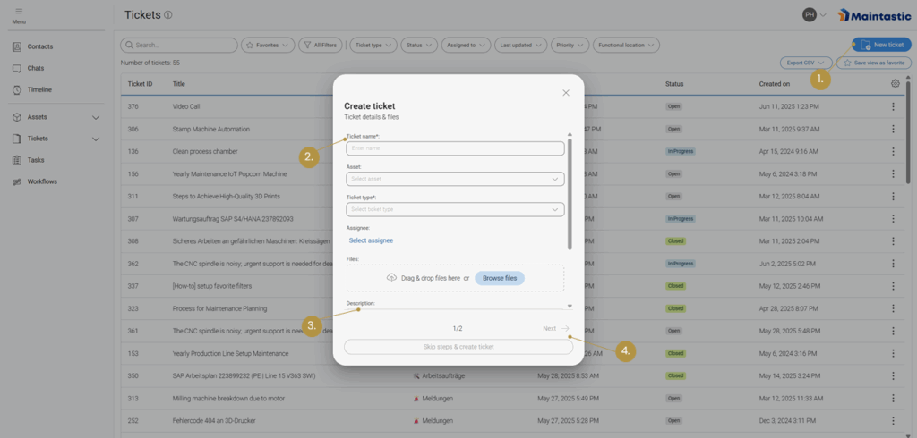
4.1.1 Create and modify tickets and define permission groups

There are two ways to create tickets:

  1. During a video call, to document the content of the video call conveniently with images, texts, screenshots, and recordings. Tickets resulting from a call can, of course, still be processed after the call.
  2. Outside of a video call, to prepare and document tickets such as audits, remote inspections, service or maintenance tickets even outside the collaboration. To do this, please navigate to ‘Tickets’ in the main navigation bar, click on ‘New Ticket’ and fill in the data in the corresponding windows (see Figure 43).
Figure 43: Creating a ticket (1. Select ‘New Ticket’ from tickets list; 2. Enter ticket type and title (mandatory); 3. Enter description, location, date and reference number (optional); 4. Add participants and add assets to the ticket (not shown in image))

Depending on the ticket type you select, there will be additional detail fields that you can fill out during the ticket creation. However, external users have limited access.

External users can assign a title, select an asset and ticket type, create a description and upload files, but they cannot assign the ticket to a user, fill in further detail fields, manage access by editing participants or add workflows. After the ticket has been created, external users can view the status, assignee, ticket type, ticket ID, linked assets, creator, date of creation, date updated, description, and video calls, but they cannot edit them. External users can communicate further information about the issue via the comment field.

For more information regarding ticket types, see Ticket Type configuration.

There are two permission groups regarding the tickets (see Figure 44):

  1. ‘View and Edit’ where the participant is able to view, edit and delete the ticket and its details.
  2. ‘View’ where the participant is only able to view the ticket and its details.
You can also display the underlying rights of the permission groups by hovering over the information icon when assigning the roles.
If you assign a permission group to a team, all users of the team take on the same access rights. If a user is assigned as a team member and has an additional permission group as an individual user, the role with more access rights applies to this user.
Figure 44: Assign permissions to ticket participants
Once you have created a ticket, you can
  • upload documents outside the video call or create and save them during a video call.
  • change the status of your ticket to ‘Open’, ‘In Progress’ or ‘Closed’.
  • schedule video calls directly in the ticket.
  • create tasks that are to be checked off within the ticket and assign them to ticket participants.
  • leave comments.
  • retrace the history of the ticket.
  • create a PDF file of the ticket.
For a detailed description of the functions please refer to the following chapters.

4.1.2 Use a ticket for documentation of video calls

4.1.3 Setting the ticket status

As you can see in Figure 45 you can set the status of the ticket to ‘Open’, ‘In Progress’ or ‘Closed’ depending on its progress.

4.1.4 Editing Scheduling Data in the Ticket Overview

If scheduling is enabled for the ticket type of a ticket (see chapter 8.3 Ticket Type Configuration), users with editing rights can adjust the scheduling data (Start Date and Due Date) directly in the ticket overview. Here, the data can be created, modified, or deleted. If scheduling is later deactivated for a ticket type, previously stored dates remain saved internally but are no longer visible or editable.

Figure: Editing the Start and Due Date of a Ticket

4.1.5 Schedule a video call and add it to the ticket

In section Scheduling video calls with internals, externals, or guests you can see how a video call is scheduled via the ‘Contacts’ list and linked to a ticket via the ‘Timeline’ menu point after its creation. It is also possible to plan a video call directly in a ticket by clicking on ‘Plan Call’ in the ticket overview. After entering the relevant data, the call is shown in the ‘Video Calls’ tab at the bottom of the page as well as in the general timeline in the main navigation bar.
Figure 45: a. Changing the status of a ticket; b. Planning a video call in a ticket

4.1.6 Comment function in tickets

The comments act as a kind of more formal chat function or discussion area where all ticket participants can exchange ideas regarding the ticket.
You can add a comment by first selecting the ‘Comments’ tab in the lower part of the workspace (see Figure 46), writing a comment and pressing ‘enter’ on your keyboard. If you press ‘shift’ and ‘enter’, you can add another line. Comments can be restricted to internal users (‘Internals Only’) or additionally sent to external users (‘Internals & Externals’) who have access to the ticket.
Figure 46: a. ‘Comments’ section of the ticket; b. Ticket ‘History’; c. ‘Video Calls’ connected with the ticket

4.1.7 History of a ticket

This function enables you to trace individual activities in a ticket. Here you can see who is adding or deleting documents, adding screenshots, changing tasks, their status, and other activities. You can find the corresponding tab in Figure 46.

4.1.8 Video calls in tickets

Click on the ‘Video Calls’ tab to display the corresponding timeline. In contrast to the general timeline in the menu bar, only the calls attached to this particular ticket are displayed here. You can find the tab in Figure 46. Also, you can link calls from your general timeline to a ticket at any time, regardless of whether they are future or past, using the ticket icon located there (see Figure 13).

4.1.9 Create and export a PDF from a ticket

In some cases, it can be necessary to create a report of a ticket, for example to make it available to externals or external programs. Therefore, Maintastic offers the possibility to generate a PDF file from the ticket, which contains all its relevant information. To create this ticket report, please click on the ‘Generate PDF’ button on the top right corner of the ticket overview (see Figure 47).

As you can see in the example PDF shown in Figure 48 and Figure 49 the report is divided into seven sections. The first one gives you basic information about the ticket:
  • Ticket ID – Shows the ID of the ticket
  • Ticket name – Shows the name given to the ticket
  • Created by – Shows the user that created the ticket
  • Created on – Shows the date when the ticket was created (UTC)
  • Status – Shows whether the status of the ticket is ‘Open’, ‘In Progress’ or ‘Closed’
  • Assignee – Shows the person responsible for the ticket
  • Ticket type – Shows the ticket type selected for the ticket

If the corresponding data fields have been filled in, this part of the PDF also contains:

  • Date – Date set by user
  • Location – Location set by user
  • Additional details depending on the ticket type

In the second section, related assets are listed with the following information:

  • Description – The description of the asset
  • Serial Number – The serial number of the asset
  • Asset type – The asset type of the asset
The third section shows the description of the ticket.

In the fourth PDF section the ‘Tasks’ (see Tasks) are listed. If the ticket participants have created tasks, they are displayed with the following information:

  • Task Title – Usually a small description given by the user of what needs to be done
  • Status – Shows whether the status of the task is ‘Open’, ‘In Progress’ or ‘Closed’
  • Assignee – The user responsible for the task

The ‘Comments’ part of the PDF, represents the ‘Comments’ tab of the ticket overview (see Comment function in tickets), which means that the following information is given here:

  • Date – When the comment was created
  • Name – Who wrote the comment
  • Message – The written message created by the user

The sixth section shows a list with the documents that were uploaded to the ticket and the video calls that were linked to the ticket. It is composed by:

  • Call name – The name of the call
  • Call information – Start time, duration and participants of the linked call
  • File – The file uploaded
  • Name – The name of the file

The last section (‘History’) presents information that was added and edited in the ticket since the creation of the ticket (see History of a ticket):

  • Date – When the modification was made
  • Description – What was added or modified by whom
Figure 47: Generating and downloading a ‘Ticket Report’
Figure 48: Different sections of the ticket report PDF
Figure 49: Different sections of the ticket report PDF

4.1.10 Uploading and Downloading files

On the overview page of a ticket, you can see a field for ‘Documents’ and one for ‘Documents > Videos and Screenshots’ (see Figure 47). While ‘Documents’ represents a high-level overview over the entire documents section, ‘Documents > Videos and Screenshots’ represents only the Videos and Screenshots folder, where all your files created in video calls are also automatically uploaded, as long as the call is attached to the ticket.
Single files or whole folder structures can be uploaded in the fields’ corresponding upload zones via drag and drop. When you drop one or more folders into either field, you will be asked which folders and files you want to upload (see Figure 50). All folders and files are selected by default, but you can simply deselect them to exclude them from the upload. When trying to upload an already existing folder, you have the options to replace the folder, to duplicate it or to skip the upload (see Figure 51). If you try to upload a file that Maintastic does not support (like an executable), the file is highlighted in red. The file in question will be deselected and you can choose to upload the folder without it.
Figure 50: Folder Upload
Figure 51: Uploading existing files or folders
When you click on a folder icon in the overview page, you will get taken to the according folder in the documents section. The number of items visible in the overview page is limited. To see all uploaded items, use the ‘Go to Documents’ button in the overview page or the left navigation menu and you will reach the documents section. Additional to uploading documents, you can download files by clicking on the download button in the overview page or the documents section (see Figure 52). Please note that it is not possible to download folders at the moment.
Figure 52: Downloading files

4.1.11 Duplicate Tickets

The duplicate function is located in the ticket’s context menu, provided that the user has the necessary permissions to create and view the ticket. The duplicate function allows internal users to quickly and efficiently copy an existing ticket. In the ticket list, the ‘duplicate ticket’ function is started for an existing ticket via the ticket’s context menu. A dialog box opens in which certain content such as description and details are copied by default, while other elements are optional. The optional elements can be selected or deselected as required. The optional elements are assets, workflows, tasks, documents, groups, and participants. The ticket name is a mandatory field that is always reset. The agent can be reset during the duplication process. Unavailable options, e.g., because there are no linked assets, are hidden in the dialog box.

4.2 Ticket Filters

To get a better overview of all tickets available to you, the ticket list can be organized using various filters (see Figure 53). Several filters can be selected by clicking the All Filters button. In the ticket list, the Start Date and Due Date of a ticket can also be displayed to provide a quick overview of schedules. These columns can be sorted and can be shown or hidden in the web interface via Customize Columns. In the mobile app, these dates are accessible through the More menu of the ticket list.

The ticket list offers dedicated filters for start and due dates to narrow down tickets to a specific time period. A calendar‑based selection and predefined quick filters simplify input. The filter remains active until it is removed.

If you work with different filter sets for different use cases, you can save the current set of filters by clicking the Save View as Favorite button. This view is then saved and can be applied at any time by selecting it from the Favorites menu.
Figure 53: Sorting the Ticket List (a. Applying various filters; b. Selecting your preferred settings; c. Displaying all available filters; d. Saving the current view as a favorite; e. Adding additional filters)
While the filter arrangements can only be created and saved on the web version of Maintastic, filters that were save as favorites can also be applied on mobile versions by clicking on the ‘Favorites’ button.
While the filter arrangements can only be created and saved on the web version of Maintastic, filters that were save as favorites can also be applied on mobile versions by clicking on the ‘Favorites’ button (see Figure 54).
Figure 54: Additional filters

4.3 Prioritized View for “My Open Tickets”

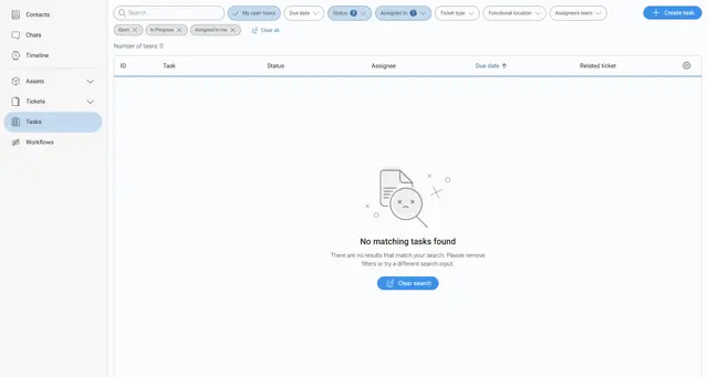
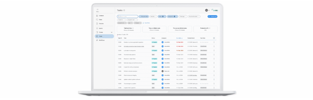
Technicians can access a dedicated view for scheduled tickets via the main menu (My Open Tickets). This view shows only tickets assigned to them that are in Open or In Progress status. The list contains important information such as: Ticket ID, Ticket Name, Ticket Type, Status, Start Date, Due Date, and Last Updated.
Visual indicators support prioritization:
  • Green: Start date is in the past
  • Orange: Due today
  • Red: Ticket overdue
These indicators disappear once a ticket is set to Completed. The view helps technicians efficiently manage their most important and time‑critical tasks.

4.4 Smartphone and tablet application

With a smartphone or tablet, users can also create and fill tickets on the go. This allows technicians to document on the road and share this information with their colleagues directly. Within the application you will find almost all ticket functionalities you know from web and can use them intuitively. For example, you can:

  • Create a ticket: The (+) symbol in the Tickets menu allows the user to create a new ticket. The user is guided through a process in which s/he assigns a name for the ticket, selects the ticket type, adds users and assets to the ticket, sets an assignee, etc.
  • Save documents in the ticket: The user can save photos, videos or other documents in a ticket in the ‘Documents’ section of a Ticket by selecting the desired option (‘Take Photo’, ‘Record Video’ or ‘Select File’).
  • Add tasks: All tasks are displayed by clicking on ‘Tasks’. You can change the status of the task from ‘Open’ to ‘In Progress’ and ‘Closed’. On mobile it is also possible to create new task with your smartphone or tablet.
  • Schedule a video call: In a ticket, the user can schedule a video call by first navigating to the Video Call tab, clicking on the new call icon and then adding the relevant data.
  • Add participants to the ticket: In a ticket, the user can add participants by navigating to ‘Participants’ and then using the (+) icon to add a new participant.
  • View the ticket history: The user can see the ticket history by selecting the ‘History’ tab.
The application will have a slightly different user interface depending on the operating system you are using. In Figure 55 you can see a ticket as it is displayed on iOS below.
Figure 55: Ticket overview on iOS

4.5 Smart glasses application

Due to their advantages in handling, smart glasses are mostly used for hands-free video communication in a production environment. However, with tickets you can also use them as a documentation tool. An adapted range of ticket functions is available on smart glasses for this purpose.

4.5.1 Accessing tickets

As soon as you have entered the tickets module on your smart glasses via the ‘Open Tickets’ button in the left side menu, you will see all tickets you have access to listed with their names and IDs (see Figure 57). From here you can access an existing ticket by selecting it from the list with the corresponding control type of your smart glasses.

Figure 57: Tickets list on smart glasses

Within a ticket there are two subpages displayed in the left menu: ‘Open Details’, which is the landing page after entering a ticket, and ‘Open Documents’.

In the details area (see Figure 58) the ticket name, the ticket id, the ticket assignee, and the ticket description are displayed. All details cannot be changed inside the smart glasses app and are for reference only.

In the documents area (see Figure 59) you can view the documents belonging to the ticket and add new photos or videos. To upload a new document to a ticket, select the desired sub-folder if necessary and choose ‘Take Photo’ or ‘Record Video’ from the right actions menu. In both cases the camera app of your glasses will open. As soon as you have finished recording, the video or photo will automatically be uploaded into the ticket and therefore becomes also visible on other devices.

Figure 58: a. Display of the ticket details; b. Switch between ticket details and documents
Figure 59: a. Display of all documents within a ticket; b. Open action menu to access the camera and take a photo or a recording within the ticket

4.5.2 Creating tickets

Starting from the tickets list, it is also possible for you to create a new ticket with your smart glasses by selecting ‘Create Ticket’ from the action menu (see Figure 60). If several ticket types are available on your platform, a dialog box opens where you must select one of them. After confirming your selection, you will be directed to the ticket details of the newly created ticket and can navigate through it like described above.
Figure 60: Creating tickets on smart glasses starting from the tickets list

Please note that this is a simplified way of ticket creation, designed to create and fill a new ticket with content in the form of images and videos as quickly as possible with your smart glasses. Therefore, the content of some fields will be set automatically or remains empty initially when created:

  • Name: Is automatically set to a default name in the format ‘New Ticket (dd-mm-yyy_hh:mm:ss)’
  • ID: The ticket ID is a sequential number set by the system. So, you can use this ID to quickly find this particular ticket again when you are logged in on other devices.
  • Assignee: As the creator of the ticket, you will automatically be set as its assignee. In this way you can use the corresponding filter option on web to find and access the ticket.
  • Description: The description field is not initially filled with content.

Every ticket you have created with your smart glasses can of course be accessed again when you log in on web or on your smartphone or tablet. You can use the functions available there for follow-up and completion.

5 Tasks

Tasks allow you to manage and track individual work items related to tickets in Maintastic SHARE. They can be created either directly from a ticket or independently via the Create Task button. Tasks help to divide complex tickets into smaller, actionable units and allow for clear assignment and due date tracking.

Tasks are accessible on the web and are displayed in a table view or, if none exist or the selected filters could not find a fitting task, as an empty state. Below you will find a detailed overview of how to use the Task module in the web application.

5.1 Web application

In the web application, full task functionality is available. Tasks can be created, edited, assigned to users, and filtered based on various criteria. Each task must be linked to a ticket, while a ticket can contain multiple tasks.

Tasks are typically used to break down service requests, inspections, or development tickets into smaller parts that can be processed independently and monitored more effectively.

5.1.1 Create and manage tasks

There are two ways to create a task:

  1. From within a ticket You can create a task while viewing a specific ticket. This ensures the relationship between the ticket and the task is established automatically.
  2. Via the “Create Task” button (see Figure 56) Navigate to the Tasks tab in the main menu and click on Create Task. The following input form will be shown (see Figure 57):
Figure 56: Task overview
Required fields:
    • Related ticket: A task must always be linked to a ticket.
    • Title: Short summary of what the task is about.
Optional fields:
    • Description: A rich text field with formatting options to describe the task in more detail.
    • Assignee: The person responsible for the task.
    • Due date: Deadline for task completion.
    • Status: Default is Open; can also be set to “In Progress” or “Done”.
Figure 57: Task creation form

5.1.2 Task overview and sorting

Tasks are displayed in a table format unless no tasks match the current filters. In that case, the following message is shown:

“No matching tasks found”

There are no results that match your search. Please remove filters or try a different search input.

You can press the Clear Search button to quickly clear all selected filters.
When tasks are available, the table includes the following columns (see Figure 58):
Column Description
ID Unique identifier of the task
Task Title of the task
Status Current state (e.g., Open, In Progress, Done)
Assignee Assigned user
Assignee’s Team Team(s) of the assigned user
Due Date Task deadline
Related tickets Ticket linked to the task

You can press the Gear Icon on the right side of the table to hide specific columns or show optional ones, which are the following:

Updated on

Date of the last update

Created on

Date of the task creation

Created by

User the task was created by

Figure 58: Overview of task filtering

5.1.3 Filtering options

Users can apply filters and sorting to better manage their task list. Available filters include:
  • My Tasks: Only show tasks assigned to the current user.
  • Status: Open, In Progress, Done.
  • Due Date: Sort by upcoming or overdue tasks.
  • Ticket Type: Filter tasks by the type of their parent ticket. Ticket types can be customized by users.
  • Assigned To: Filter by specific user(s).
  • Functional location: Apply filters by their functional location (see 6.1.1 Structuring assets with the Functional Location).
  • Assignee’s Team: You can filter by the teams of the assigned user.

5.1.4 Edit and delete tasks

Tasks can be edited or deleted directly from the task table in the Tasks tab. These actions are accessible in the following ways:

  • Edit Task
    You can open a task for editing in two ways:
    1. Click the task title (e.g., “Adding new”) to open the task in edit mode.
    2. Select “Open task” from the options menu (︙) on the right side of the row

Once open, all task details such as title, description, assignee, due date, and status can be modified. Changes are applied by clicking the Update button.

  • Delete Task
    Use the options menu () on the right-hand side and select “Delete” to permanently remove a task. A confirmation dialog will be shown before final deletion.

5.2 Smartphone and Tablet application

On Smartphone and Tablet devices, the Task module is available in a simplified and mobile-optimized view. Users can view, manage and edit their tasks on the go. The mobile experience focuses on personal task tracking and fast interaction.

5.2.1 Accessing Tasks

To access your open tasks, open the main menu and select My open tasks (see Figure 59 and Figure 60) This will take you to a filtered view showing only the tasks currently assigned to you. Tasks are listed with their title, due date, related ticket, current status, and assignee.
Figure 59: Mobile task menu IOS
Figure 60: Mobile task menu Android

5.2.2 Managing Tasks

The task list is filtered by default to show your open tasks, but you can apply or adjust filters by status, assignee, due date, ticket type, functional location, and assignee’s team. Each task entry offers interactive options (see Figure 61):
  • Tap the task title to open and edit the task.
  • Tap the three-dot menu to open the options dialog to edit or delete the selected task
Figure 61: Task overview mobile

5.2.3 Adding and Editing Tasks

Tapping a task or the “+” icon in the bottom right will open the task editor. You can modify (see Figure 62):
  • Title
  • Description (optional)
  • Assignee
  • Due date
  • Status (Open, In Progress, Done)

Additionally, metadata is shown at the bottom (Created by, Created on, Updated on). Changes must be saved by tapping the Save button at the bottom of the screen.

Figure 62: Task creation mobile

5.3 Task-Ticket Relationship

Every task must be linked to one ticket. A single ticket can have multiple tasks associated with it. This structure allows teams to divide work logically and ensure traceability between tickets and their execution steps.

6 Assets

‘Assets’ are used to provide and structure technical documentation using the web application and link it to a QR code. This QR code can then be printed out and attached to the real asset or machine it represents. By scanning the QR code, users of smartphones or smart glasses can call up the documentation and tickets of this specific asset again.

6.1 Web application

The following subchapters will give you a comprehensive overview of the full range of functions in the assets module on web.

6.1.1 Structuring assets with the Functional Location

The Functional Location serves as a hierarchical structure for organizing assets (systems, machines, components) within the Maintastic software. It enables logical assignment and facilitates filtering and finding information. The asset list can be filtered by a functional location and asset types (see Figure 63). Filtering for specific asset types can help if you want to see an overview over all assets of a certain type. Functional locations can also be created to get a better overview of your assets, especially if they are distributed over multiple locations or if they belong to different production lines.
Figure 63: Asset Liste filtern und sortieren
The functional location consists of multiple layers of folders and subfolders, in which assets can be contained (see Figure 64). These layers can correspond to locations, buildings etc. or to production lines as seen in this example. To edit the Functional Location select (b.) “Edit Functional Location”. (Note: This Option is only available for Asset Manager User).
Figure 64: Using and editing the asset path

6.1.2 Functions for Asset Manager Users: create, rename, move, delete

Figure 65: Functional Location "Edit" Options for Asset Manager User

Creating a new Functional Location

Purpose: Create new structural points for organizing assets.

  • Click Add New (1) and select New Folder.
  • Enter the name of the new Technical Location (e.g., “Production Hall 1”).
 

Renaming a Functional Location

Purpose: Adjust the name in case of changes or corrections.

  • Open the desired Functional Location and click the context menu.
  • Select Rename (2) and enter the new name of the Functional Location.
 

Moving a Functional Location

Purpose: Modify the hierarchical structure (e.g., moving from one hall to another).

  • Open the desired Functional Location and click the context menu.
  • Select the option Move (3).
  • Choose the new parent location and select Move here.
  • Note: Subordinate assets are moved automatically.
 

Deleting a Functional Location

To remove structural points that are no longer needed:

  • Open the desired Functional Location and click the context menu.
  • Select the option Delete (4).
  • Important: Check first whether assets are assigned to this location. These may need to be reassigned. You can find assets that are not assigned to any Functional Location in the folder Uncategorized Assets in the first filter level.

6.1.3 Functions for Default Users: Filtering by Functional Location

Filtering the Asset List by Functional Location

To quickly find assets within a specific structure:

  1. Go to the asset list.
  2. Use the Functional Location filter.
  3. Select the desired location or a hierarchy level.
  4. Result: Only assets assigned to this location are displayed.


Filtering other Lists (Tickets, Tasks, Workflows, Reports) by Functional Location

To get an overview of all activities related to a specific location:

  1. Open the respective list (e.g., Tickets List).
  2. Use the Functional Location filter.
  3. Select the desired location.
  4. All relevant objects connected to the assets installed at the functional location are displayed.


Searching within the Functional Location Hierarchy

To quickly locate a specific Functional Locations or assets:

  1. Open the Functional Location Filter
  2. Select the desired Functional Location using the filter.
  3. Use the search bar (6) to enter the assets or Functional Locations name or the serial number.
  4. Only items within the selected functional location matching the search criteria are displayed.

6.1.4 General structure: asset, component, and subcomponent types

When creating an asset, the user is requested to select the ‘Asset Type’ the new asset belongs to. Within this asset, it is then possible for the user to divide it into components and the components into subcomponents. In this way, a ‘Asset Tree’ (see Figure 66) is created to clearly structure the overall asset. Documents can then be added at any level of the asset tree.
Figure 66: Asset tree showing the added components and subcomponents of the asset
The overall structure of the asset (Which components can belong to which assets? Which subcomponents can belong to which components?) cannot be freely determined by the user but is determined by the administrator or asset manager in the management area (see Asset types, component types and subcomponent types). The administrator / asset manager can extend the levels with additional data fields (called ‘Keys’), which are displayed to the user when a new instance is created.

6.1.5 Create and modify assets and define permission groups

After an asset type has been created, you can create concrete instance of an asset (see Figure 67).
  • Go to ‘Assets’
  • Click on ‘New Asset’
  • Fill in the serial number (mandatory)
  • Fill in the description (mandatory)
  • Add participants and define access rights for them
  • Select an asset type (mandatory)
  • Fill out the data fields belonging to the asset type
  • Add the asset to an asset path
  • Link tickets to the asset if needed
  • Link workflows to the asset if needed
  • Click on ‘Submit’
Figure 67: 1. Create a new asset; 2. Enter serial number and description; 3. Add participants and define access rights; 4. Select asset type; 5. Add asset to an asset path; 6. Add tickets
There are two permission groups regarding the assets (see Figure 68):
  1. View and Edit: The participant is able to view, edit and delete the asset and its details. This is the default role for internal users.
  2. View: The participant is able to view the asset and its details. This is the default role for external users.
You can also display the underlying rights of the permission groups by hovering over the information icon when assigning the roles.
Figure 68: Define roles and permissions for asset participants (a. Define user as asset expert; b. Select permissions for asset participants; c. Display the underlying rights of the permission group)
If you assign a permission group to a team, all users of the team take on the same access rights. If a user is assigned as a team member and has an additional permission group as an individual user, the role with more access rights applies to this user.
Participants of an asset can also be added as ‘Experts’ (see Figure 68). Experts have a special function for assets. When you declare a team or a user an expert, they are contacted when a user makes a service call about this asset.

6.1.6 Add technical documentation to an asset

With Maintastic you can add technical documentation, e.g. in form of PDF, image or video files, to an asset or its (sub)components. Even referencing specific pages of a PDF document to (sub)components is possible.

Uploading technical documentation

To add PDFs, images or videos to an asset, a component, or a subcomponent, proceed as follows (see Figure 68):
  1. Select the asset, the component or subcomponent in the asset tree you want to add documentation to.
  2. Upload the relevant documents by using the drag and drop area at the right side of the workspace or by clicking on the ‘Search’ button in the same area.
Figure 69: Uploading technical documentation to an asset (1. Select the level you want to add documentation to; 2. Drag and drop documents or search for them for upload)

Referencing documents

By using the ‘Reference Document’ functionality, you can reference a specific page of a PDF document that was already uploaded to an asset or any of its components or subcomponents to any other component or subcomponent of the same asset.
  1. Open the ‘Documents’ section of an asset
  2. Click on the ‘+’ button next to a component or subcomponent (see Figure 70)
  3. Select the PDF document you would like to reference to this component (see Figure 71)
  4. Select the page you would like to reference to this component and enter a name for this reference (see Figure 72)
Alternatively, you can use the ‘Reference Document’ button to link a specific page of a document to the asset.
Figure 70: Referencing documents (1. Open documents section of the asset; 2. Select the ‘+’ button)
Figure 71: Referencing documents (3. Select the PDF document to be referenced)
Figure 72: Referencing documents (4. Select the page to be referenced)

6.1.7 Related tickets

When creating or editing an asset you can select existing tickets from the dialog to link them to this asset. Also, when creating or editing a ticket you can link it to one or more assets in the corresponding edit window. Accordingly, all tickets that belong to an asset are displayed in its overview as ‘Related Tickets’. These can be accessed by clicking on the ticket. Also, there are icons to reach the tickets’ documents directly, edit its data or remove it from the asset. (see Figure 73).

6.1.8 Related workflows

Similar to tickets, you can link existing workflows to the asset when creating it. After the asset is created, you can still link new workflows by clicking on the ‘Edit’ button in the assets menu. All linked workflows will show up in the list ‘Related workflows’.

6.1.9 Print QR codes and apply them to an asset

You can generate the QR code of an asset (see Figure 72), print it and apply it to the real asset. By scanning the QR code, you can then retrieve the asset details and technical documentation.
Figure 73: a. View and edit asset related tickets and workflows; b. Generate an asset specific QR code

6.1.10 Adding components and subcomponents to an asset

As mentioned in General structure: asset, component, and subcomponent types an asset can be subdivided into components and subcomponents. At asset level, the ‘Add Component’ and at component level, the ‘Add Subcomponent’ button must be clicked to do so. Depending on whether the administrator or asset manager has added additional data fields for the selected (sub)component type, these will be displayed and can be filled in by the user. In Figure 74 and Figure 75 the procedure becomes evident.
Figure 74: Adding a (sub)component to an asset (1. Select the ‘Add’ button)
Figure 75: Adding a (sub)component to an asset (2. Fill in the description, select a type and fill in additional data fields if available for the type)

6.1.11 Duplicate Assets

The duplicate function allows you to copy an existing asset. To duplicate an asset, open the asset list and start the “Duplicate Asset” function via the context menu of the desired asset. A dialog box opens in which basic information such as the name of the asset and a new serial number must be entered. This serial number clearly distinguishes the new asset from the original. All other content such as components, subcomponents, and documents are transferred by default. In addition, you can decide whether linked workflows should also be copied. There is also an option to include tickets linked to an asset. There are three choices here: either no tickets are transferred, existing tickets are simply linked, or they are completely duplicated. If the last option is selected, the system copies all tickets associated with the original, including their contents, and creates new tickets from them, which are automatically linked to the duplicated asset.

6.2 Smartphone and tablet application

The assets and their technical documentation can also be viewed on the smartphone and tablet application by internal users and external users with corresponding ‘Assets’ permissions (see Permission system and permission groups for external users). The desired asset can be selected via its associated list entry or by scanning its QR code. The button to open the QR code scanner is located on the overview page of the assets above the asset list (see Figure 76).
The asset functionalities of internals and externals in the smartphone and tablet app differ slightly. The following subchapters provide a brief overview of this.
Figure 76: Calling up assets via the asset list (a. Selecting an asset from the list; b. Opening the QR scanner to call up the asset by scanning its QR code)

6.2.1 Asset functions as internal user

An internal user can view all participants and experts of the asset and initiate a call or chat with them. S/he can also view the asset’s components and subcomponents as well as the attached documents on any level. With ‘edit’ permissions on the asset, the user can upload photos, videos, or files to it. Connected tickets are shown in a corresponding tab, which allows the user to quickly access the ticket overview of connected tickets.

6.2.2 Asset functions as external user

On condition that the external has been assigned the ‘Assets’ permission group, s/he receives access to the assets in which s/he is a participant. The external user can view and call the asset experts, but no other asset participants. The user can also view the asset’s components and subcomponents as well as the attached documents on any level. It is not possible for an external user to add documents to the asset.

6.3 Smart glasses application

If you select the ‘Assets’ tab in the left side menu bar, the assets list will open (see Figure 74). You can either select an asset from this list or you can open the QR code scanner by selecting the ‘Scan Asset’ button in the action menu on the right side. You can use this scanner to scan a QR code belonging to an asset (this code must be generated in the web application of the software, see Print QR codes and apply them to an asset). Both variants lead you directly to the asset details of the selected asset (see Figure 75). Within an asset there are three subpages: ‘Open Details’, ‘Open Documents’ and ‘Linked Tickets’. In the details area of the asset, the button ‘Contact Expert’ will take you to a list of experts that have been assigned to this asset. It is possible to initiate a call with them by selecting the contact from the then displayed list. In the documents area, which resembles the document section of the tickets (see Figure 59), you can view the documents belonging to the asset. As an internal user with edit rights, you can also add new photos or videos. To do this, select ‘Take Photo’ or ‘Record video’ from the action menu (right side). In both cases the camera app of your glasses will open. As soon as you have finished recording, the video or photo will automatically be uploaded into the asset. Please note, however, that all documents listed here belong to the overall asset and not to any components or sub-components you may have created in web. Under ‘Linked Tickets’ you can see all Tickets connected to the asset and jump into them.

Figure 74: Display of the ‘Assets’ section in the smart glasses app for external users (internal similar) (1. Open assets module; a. Select asset from list; b. Open QR scanner to call up the asset by scanning its QR code)
Figure 75: Asset overview on the smart glasses application (a. Subpages ‘Open Details’, ‘Open Documents’ and ‘Linked Tickets’; b. Open the expert list to initiate an expert call)

7 Workflows

The workflows module has been developed to support shop floor workers, technicians, and engineers with new and unfamiliar tasks. A workflow is a structure that guides the user through solving complex tasks by himself. Workflows can be easily compiled by anyone through a simple and easy to understand web application. Created workflows may be versioned and released to workers through one click. Workflows are played back on mobile devices directly on the fly. Depending on user preferences smartphones, tablets or smart glasses can be used by the worker. If the task requires it, different types of feedback may be returned to the system. Based on this feedback reports on the results of the workflow completion are created automatically. The principle of the workflows module is shown in Figure 77.
Figure 77: Workflows module principle

7.1 Web application: Create, manage, distribute, and evaluate workflows

In the following section you will receive an introduction on how to use the workflows module in the web application of Maintastic. The main tasks like the workflow creation, the workflow versioning system, the distribution, and reporting will be explained.

If you cannot find the workflow module on your platform, your company has not unlocked this module for you. Please contact your Maintastic administrator to talk about your needs to use the workflows module.

7.1.1 Creating a new workflow

To create a new workflow, you as a workflow editor open the Maintastic web application in the browser and navigate to the ‘Workflows’ tab in the left side menu. On the first page in the ‘Workflow list’ tab, you find a list of existing workflows on the platform that you already have access to.
The general procedure to create a workflow starts with clicking on the ‘New Workflow’ button. Now a window opens, as shown in Figure 78 where you can enter the name of the new workflow, the description, and all participants. Furthermore, you can upload a thumbnail and link assets to the workflow. Participants can be added either individually or in teams (see Create and administrate teams on how to group individual users into teams) and given different access rights. The ‘View’ option allows the participant to see and execute the workflow only, while the ‘View & Edit’ option allows the participant to make changes as well.
Figure 78: Creating a new workflow (1. Open Workflows module; 2. Select ‘New Workflow’; 3. Enter a name; 4. Enter a description; 5. Add a thumbnail image; 6. Scroll down to add participants and link assets)
All this information can be adapted and changed later as well. The newly created workflow appears in the workflow list with all workflows you have access to. Here you also have the option to either duplicate the workflow () , add participants () , delete () the selected workflow or to show the QR code of the workflow ().The QR code is a deep link to the workflow. Scanning the QR code with any QR code reading app will take a user that is logged into the Maintastic app directly to the workflow. If a user has an account but has not installed the app, they will be guided through the app download and login. If you duplicate a workflow, only the latest version of the workflow will be duplicated, the version history will not be available in the duplicate (you will find more details on versioning later in this chapter). The process of duplicating a workflow can take a while, depending on its size.
By submitting the new workflow, you directly get transferred to the ‘Editor’ tab of the workflow. Here the main workflow is created. In addition to the editing area, there are also other tabs, as shown in Figure 79. These allow you to see an overview and to simulate the workflow (‘Overview’) or to view the workflow’s version history (‘Versions’). In the ‘Reports’ tab, the workflows performed and submitted by the worker can be viewed. The other tabs show the ‘Linked Assets’ and the ‘Participants’ of the workflow. These tabs will also be discussed in detail later within this chapter.
Figure 79: Edit tab of the workflow module
In the editing tab you will find a description, an (empty) list of steps and general information on the workflow. By clicking into the ‘Create a step’ box in the list of steps you will create a step of the workflow. Upon creating a new step, you are first asked to choose the step type.
In total there are currently nine different step types (Figure 80). The step types are divided into instruction and feedback steps. The instruction steps provide guidance and information on how to do a certain task by using video, image, text, or PDF instructions. The feedback steps are used to request an input from the user. For example, you can ask the user to capture an image, write a text, select an answer from a list or verify action by scanning a QR code or with a digital signature.
Figure 80: Step options currently available in the workflows module

Creating video, image, PDF or text instruction steps in a workflow

After choosing the step type in the workflow editor you can set the content of the step. For all steps this includes a title and a description. Based on the step type, additional content may be added to the step.
Our research has shown that videos are a great tool for instructing users in a workflow. The filling of a video step with content is shown in Figure 81.
Figure 81: The video instruction step (a. Change step type if necessary; b. Enter step title; c. Drag and drop video file here; d. Delete content; e. Download content; f. Add a description to the step)
Let’s take the example of a maintenance procedure, that should be explained through a series of videos in a workflow. Ideally you can perform the maintenance procedure and directly record the videos yourself while doing so. This is possible using smart glasses like the RealWear HTM-1 or Navigator 500. With this device you can create videos hands-free by starting and ending the recording at the right moment with a voice command.
Of course, you can also use smartphones or tablets to record videos. Most mobile devices also have a built-in video editing tool for basic operations such as trimming and cropping a video clip.
Depending on the device used for the recording and the specific settings used during the recording, the video file size may be significant. To avoid lagging during the video playback and high data rates, you can compress the video. A great open-source software for this task is Handbrake (refer to info box bellow).

Tip: How to compress a video?

To ensure a smooth playback, the video often needs to be compressed. This allows the user to easy play the workflow without interruption. A possible software is HandBrake.

You can get the open-source video compression tool here: https://handbrake.fr/

The other file types currently supported for upload in a workflow are images and PDF documents. You can upload the documents for each step individually, or you can select multiple files and upload all of them at once via drag and drop. The workflows editor automatically converts the files into steps.

If the material of an already existing workflow is needed for a new workflow or another use, the possibility of downloading the pictures, videos, etc. from the Maintastic platform exists. To do this, go to the step with the desired material and then click on the download function ( ) in the upper right corner under the delete button (see Figure 81). If you want to use most of the workflow again, the duplicate function could be used in the workflow list. This function allows you to copy a whole workflow.

Including image, text, options or QR code feedback steps in a workflow

Once you have added the instructions to the workflow, you may want to also add some feedback steps to request input from the user.
Figure 82: Adding an options feedback step to the workflow (a. Change step type if necessary; b. Enter step title; c. Enter description; d. Mark step as single or multiple choice; e. Enable the user to give a text feedback on the selected choice; f. Add another option to the list)

In Figure 82 the multiple/single choice feedback is shown as an example. In this example we request the user to answer a Yes or No question. Therefore, we first set the title and question, then add the answers for the user to choose from. We have the option to choose between a single- or multiple-choice answer. Additionally, a text feedback can be added to an answer. In this example, an explanation is demanded if the question is answered with ‘No’.

Figure 83: Other feedback steps (image feedback step, text feedback step and QR code verification)
In Figure 83 three other possible feedback steps are shown: QR code verification, image, or text feedback. The QR code verification can be used, for example, when you want the workflow viewer to first verify if s/he uses the correct machine or material for the workflow. Therefore, the viewer will scan a QR code on the machine during the workflow execution and immediately receive feedback whether it is the correct or incorrect machine or material. You have the possibility to create the QR Code in three ways: using an existing QR code, generating a new one randomly or specifically for a predefined string. The image feedback can be used to add e.g., an image of the machine or a task and the text feedback can be used to add e.g., a further explanation of the instructions. To verify that the workflow was completed, a digital signature step can be added as an additional step (see Figure 84). The person executing the workflow will then be asked to give a digital signature, e.g. on a smartphone or a tablet.
Figure 84: Demanding a signature as feedback

Labeling workflow steps as ‘mandatory’

Once a workflow step was created, you can mark it as ‘mandatory’ in the step list (see Figure 79). This way you ensure that these steps have been seen by the executors, as they cannot submit the workflow without the mandatory steps being checked off.

7.1.2 Simulating a workflow

While creating a workflow it may be helpful to see the created content from the worker’s point of view. To do this you can open the ‘Overview’ tab within a workflow and click on the ‘Execute’ button in the top right corner, even if it is not released yet. For more information on how to execute a released workflow on the smart devices or smart glasses, go to Mobile applications: Execute workflows.

7.1.3 Releasing workflows and versioning

It is important to note that the workflow will only be available to users with ‘edit’ permissions before its release. Editors can therefore first edit the workflow in private and release it to the users with ‘viewing’ permissions once they are satisfied with the result. Please note that the workflows cannot be edited on smart glasses, smartphones, and tablets but only in web, meaning that even the editors cannot access an unreleased version of the workflow on those mobile end devices.

You release the workflow by clicking on the ‘Release Version’ button in the ‘Editor’ or ‘Versions’ tab. After this, the approved persons or groups are now allowed to see and execute the workflow from their list even with mobile end devices.

After releasing, the editors can still do changes to the workflow. However, these will then be made to a new version number. To handle different version of the workflow a dedicated ‘Versions’ tab is integrated in the web application (see Figure 85). Releasing a new version of a workflow automatically closes the previous version of workflow and creates a new version that may be used for editing. Participants with an ongoing execution of the old version will be able to finish this execution, but new executions will always start on the newly released version.
Figure 85: Versions of a workflow
In our example in Figure 85 you can see that there is already a closed version of the workflow ‘Printing Process 3D Printer’ (V-1). Version V-2 is the currently released version of the workflow and version V-3 is in editing and could be released by the editors. If there were still open executions, they would be displayed under the version number, regardless of the status. This way you will always know how many executions have been started but not yet completed and to which version they refer.

7.1.4 Workflow reports

After a user completes and submits a workflow, a report is created. This report may be reviewed in the web or on a mobile device. In this report all the steps the user executed, as well as the feedback elements, are saved and displayed. This includes the instruction steps as well as the feedback steps.

Workflow specific reports

You can find workflow specific reports in the ‘Reports’ tab of a workflow. Each report also contains the version number, the person who executed them, and the date they were submitted on. By clicking on the report, the view as shown in Figure 86 is presented.
You can now decide, depending on which information is important, to either see all steps with their input or to filter the report by the feedback steps. In the report all executed steps are marked with a green checkmark. Next to each step the time spent on the step is shown.
The platform administrator can decide either to activate or deactivate the time-tracking function. This option allows you to see which steps took users the longest to complete, allowing you to adjust the workflow to offer more support on those tasks to the user.
When a workflow is completed, the report will also be generated as a PDF file automatically. The report contains metadata of the executing user, the submission date, linked assets, the description, and the content of the workflow. The report can also be configured to contain the entire content of the workflow or only the feedback provided by the user.
The PDF can be accessed by the user on their mobile device and be previewed before the final submission. After that, the report can be distributed via the standard sharing options on mobile devices. Reports can be configured to be sent automatically to a specific email address.
Figure 86: Reporting section shown in the web browser

Report list

In addition to the workflow-specific view of the reports via the corresponding tab within a workflow, it is also possible to view all reports to which one has access in a comprehensive list (see Figure 87). This can be accessed via the ‘Report list’ tab directly after opening the workflow module.
Within the report list, you can limit the overview of submitted reports to a specific time period and use the filter options by specific workflows and linked assets.
It is possible for you to export the entire list or a list restricted according to your search and filter criteria as a csv or to click on individual workflows and export the PDFs described above for them, for example.
Figure 87: a. csv export; b. Restricting the list to a specific time period; c. Filter by specific workflows and linked assets; d. Tab of the reports list.

7.1.5 Asset Links

In the ‘Linked Assets’ tab, you can find the assets that are associated with the workflow and you can add new asset links, provided you have permission to edit the workflow and the asset you want to link. A workflow can be linked to several assets and an asset can be linked to several workflows. Linking workflows and assets as well as accessing a specific asset via its QR code (see Print QR codes and apply them to an asset) simplifies access to asset-specific workflows for the mobile device user on the shopfloor. The user also has the possibility to search for a specific workflow within the corresponding tab of the asset.

7.1.6 Inviting users & QR code access

Clients can be invited to execute a specific workflow via a notification email. To do so, simply click on the ‘Share’ button on the top right of the workflow page. Then you can add recipients and an optional note. Besides that, a workflow can be accessed on a mobile device by scanning the QR code with any QR code scanner. The user will then be automatically directed to the app or the app download page.
Once you have completed the workflow drafting process, you may Maintastic the workflow with other users. The participants who will be able to view the workflow after publishing can be set individually for each workflow created in the workflow module. To do this simply add the users to the workflow by clicking on the ‘Edit Participants’ button. You can add a whole team or single users. The process for creating a team is explained in Create and administrate teams.

7.2 Workflows in the Mobile App

7.2.1 Execution of Workflows

The user can execute a workflow on different devices, including tablets, smartphones, or smart glasses. Pick the device that fits best for your use case (e.g. RealWear if you need your hands free).

To find the workflow you want to execute, you can search for a specific workflow by name, using the search bar shown in Figure 88. Upon clicking on the workflow, you get taken to its overview page. There you get up-front information about the workflow like its description or your status of the execution. Other tabs belonging to the workflow are the step list, reports and linked assets. After starting the execution of a workflow, the sequence of steps defined in the web editor is shown in the workflow viewer. You can then click through the steps one-by-one. Alternatively, you can scroll through the list of workflow steps and only select specific steps to execute. The progress through the workflow is saved, so that you can leave the application and later continue the workflow in the same place. The progress is indicated through a completed steps indicator.

Figure 88: Accessing and executing a workflow on mobile (a. Search by name; b. Select workflow from list; c. Mobile overview page; d. Description; e. Workflow step list; f. Go to next step or previous step)
The right image of Figure 88 shows the tablet view of a video step in the execution. Additionally, a step description could be shown in the bottom half of the screen. This information can be displayed or hidden by clicking on the description icon. During the playback of the video, the viewer can pause it, and by using the timeline under the video, jump back and forth in the video. If any information in the video or image is not clear enough, the workflow viewer can zoom in during the video is streaming or when it is paused (only on iOS, not Android). Zooming works by pinching with two fingers.

In addition to the instruction steps, the user can be asked to give some feedback. Therefore, you have the possibility to add a choice feedback or, to give image or text feedback as well as verifying a machine or material via QR code (see Figure 89). As an example, the workflow viewer may document the final result in an image or gives text feedback if the function test was successful.

The execution on the mobile devices is completed once the user clicks on ‘submit workflow’. Upon submitting the workflow execution, an automatic check is made whether the execution was completed successfully. This is the case if you have completed all mandatory steps of the workflow. The corresponding report can be previewed before submitting it and then be viewed on mobile or web (see Figure 90).
Figure 89: Option, image and QR code feedback shown on the tablet
Figure 90: Workflow reports on mobile

7.2.2 My Executions & Reports List

In the Workflows module of the mobile app, a new tab titled “My Executions & Reports” provides technicians and field operators with a centralized view of their workflow activities (see Figure 91).

Figure 91: Mobile View of Workflow Executions & Reports
The tab is divided into two sections:
  • My Ongoing Executions, listing all workflow executions assigned to the logged‑in user that are “in progress” or “paused”, and
  • My Reports, showing all submitted and completed executions by the logged in user.
Each entry displays the workflow name, executor, start or submission timestamp, workflow version, and the linked ticket. Users can interact directly with the listed executions by continuing, reviewing progress, or discarding an ongoing workflow, while completed entries allow viewing, sharing, or downloading the generated PDF report. The List view can be filtered by the Functional Location showing all Reports & Execution of a Workflow linked to an Asset and it’s location.

8 Management Area

In the following subchapters, the functions of the ‘Management’ area are explained in detail. The management area can only be accessed through the web application and you can find the corresponding tab in the lower part of the left side menu. To get full access to the management area of Maintastic you need administrator rights. Limited access to the area is also given to users of the permission groups ‘Asset Managers’ and ‘User Managers’. Please refer to Permission system and permission groups for internal users for more information on the permission system.

The management area can be divided into three following subsections:

  • Users, teams and invitations: Creating and managing user accounts and teams.
  • Asset types, component types and subcomponent types: Creating and managing asset types and structure.
  • Platform configuration and statistics: Manage platform settings and export statistics.

8.1 Users, teams and invitations

The following chapter will describe how to create new and manage existing user accounts, as well as how to create and organize team structures.

8.1.1 License types

When creating users, you must select the license type for them to use. This is the full license the only available option at the moment.

Full license: This license type assigns one license to one user account. The user can even login to multiple devices with this license. The only restriction here is that the user cannot be in more than one video call at the same time.

8.1.2 Creating internal contacts

To add a new internal user to the platform, you must be logged in as a user with the permission group ‘Administrator’ or ‘User Manager’ and be in the management area of the software. From here you have two options for creating the user: The ‘Users’ tab and the ‘Invitations’ tab.

Creating internal users via ‘Users’ tab

When choosing the path via the ‘Users’ tab, you enter the user details yourself and even set a password. In this case you have to communicate these details to the user so s/he can log into the platform. The user creation takes place as follows (also see Figure 92):
  1. Go to ‘Management’ area
  2. Go to the ‘Users’ tab
  3. Click on ‘New Internal User’ button
  4. Fill in the user data *1 (username, first name, second name, license type etc.)
  5. Enter a user password *2
  6. Add user to team(s)
  7. Click on ‘Submit’
The user can now be found in the list-view of the ‘Users’ tab.

*1: Information about permission groups and teams can be found in Permission system and permission groups for internal users and Create and administrate teams
*2: Strong password policy – At least 9 characters including lowercase and uppercase letters, numbers and special characters. Include at least one special character, e.g. !@#?. Do not use a password that is the same to your username or similar to it.

Figure 92: Creating internal users via the ‘Users’ tab (for the explanation of the points please refer to the list above)

Creating internal users via ‘Invitations’ tab

When choosing the path via the ‘Invitations’ tab, you only have to enter the new user’s email address and s/he will receive an invitation email from Maintastic. In this case the user sets his details and password himself after accepting the invitation. Proceed as follows to send out the invitation (also see Figure 93):
  1. Go to ‘Management’ area
  2. Go to the ‘Invitations’ tab
  3. Click on ‘New Invitation’ button
  4. Enter the email address of the internal user(s), who you want to add (you can add multiple email addresses to the email box or copy email addresses from a file into the box. You divide the addresses with a space or a coma between them, or by hitting ‘Enter’.)
  5. 5. Fill in the rest of the form (information about permission groups and teams can be found in Permission system and permission groups for internal users. If multiple email addresses are inserted, they will have the same permission groups, etc.)
  6. Click on ‘Submit’.
After sending the invitation, the user in question is listed in the ‘Invitations’ tab with the status ‘Pending’. In this state the admin can use the icons to send the invitation email again (arrow icon) or cancel the invitation (trashcan icon).
As soon as the potential user accepts the invitation, his status changes to ‘Accepted’ and s/he can be found in the ‘Users’ tab as well.
Figure 93: Creating internal users via the ‘Invitations’ tab (for the explanation of the points please refer to the list above)

8.1.3 Permission system and permission groups for internal users

Maintastic has a permission system that is based on a long list of individual permissions. From this pool six global permission groups with different access rights to the platform have been predefined:

  • Administrators
  • Asset Managers
  • User Managers
  • Workflow Managers
  • Ticket Managers
  • Default Users
The platform administrators can assign one or more of these permission groups to every internal user individually when creating a new user or editing an existing one in the management area (see Figure 94). This ensures that the users only have access to the areas of the software to which they are supposed to have access to. The access rights belonging to the groups are briefly described in the following. A detailed description will be displayed if you hover over the green ‘information’ icon when assigning the users to the groups.
Please note, that even as an administrator, it is not possible for you to create your own permission groups. If the six predefined groups do not meet the needs of your company, contact Maintastic to find a common solution.
Figure 94: Permission groups for internal users

Administrators

Selecting this permission group makes the user an administrator for the platform. The user then has access to all functionalities of Maintastic including every tab of the management area.

Asset Managers

This permission group can see, add, edit, and delete assets, asset types, component types and subcomponent types. To do so, members of this group get access to the corresponding tabs of the management area.
Please note that the asset manager has view and edit access to all assets regardless of the permission assigned to them on individual asset level.

User Managers

Users of this permission group get access to the ‘Users’, ‘Team’ and ‘Invitations’ tabs of the management area and can see, add, edit, and delete internal and external users as well as teams. They can also view and edit team members. User managers can also view and edit the license type of other users. Note that only users from the permission group ‘Administrators’ can change the permission group of other users.

Workflow Managers

This group can see, add, edit and delete all workflows.
Please note that the workflow manager has view and edit access to all workflows, regardless of the permission assigned to them on individual workflow level.

Ticket Managers

This group can see, add, edit and delete all tickets.
Please note that the ticket manager has view and edit access to all tickets regardless of the permission assigned to them on individual ticket level.

Default Users

This group has the default functionalities of Maintastic which means that its members can for example create calls as well as create and edit the tickets, assets and workflows according to their specific permissions (‘View’ or ‘View and Edit’). Through the ‘Contacts’ tab they can also view contact details (first name, second name, username, email, phone number, department) and the teams in which they are together. For a more detailed description, please refer to the ‘information’ icon again when assigning the permission group.

8.1.4 Creating external contacts

External contacts can be suppliers or customers to whom you want to grant access to some Maintastic functions. ‘Administrators’ and ‘User Managers’ can create external users from the management area on the ‘Users’ tab or from the ‘External Contacts’ tab of the ‘Contacts’ menu (see Figure 95). Please note that ‘Default Users’ can use the path over the ‘Contacts’ to create external users as well.

When filling out the form for the creation of a new external user you are required to at least:

  • enter a username,
  • enter an email address,
  • choose a type of authentication option for the external (see below for detailed descriptions),
  • select a team (see Create and administrate teams within this chapter) and
The steps are shown in Figure 96 und Figure 97 based on the user creation via the ‘Users’ tab in the management area, but the form looks the same if you choose the way via the contact list.
Figure 95: Creating external users from the ‘Users’ tab (1. Open the management area; 2. Go to the ‘Users’ tab; 3. Select ‘New External’)
Figure 96: Creating external users from the ‘Users’ tab (4. Add data of the new external user; 5. Choose type of authentication;)
Figure 97: Creating external users from the ‘Users’ tab (6. Assign application functionalities; 7. Assign the new external to a team)
Regarding the authentication you can choose between three different types explained in the following.

‘Set Password’ authentication

Here, you set the external user’s password yourself. When the ‘Send email’ box is checked, the external contact receives an email with this password and information about the username and company key s/he must enter to log in. If the ‘Send email’ box is not checked, you have to communicate these details to the external.

‘Set Password via email’ authentication

Similar to the invitation of internal contacts, the external receives an email asking him to set a password for himself. The ‘Send email’ box is checked by default.

‘QR Code’ authentication

The external user logs in by scanning a QR code, which is valid as long as it is not changed by internals. When the ‘Send email’ box is checked, the external contact receives an email with the QR code and information about the username and company key. If the ‘Send email’ box is not checked, you must provide the code to the external user in another way, for example by printing it out and sending it to the external user. You can always find and call up the QR code in the ‘External Contacts’ section of your ‘Contacts’ list and regenerate it in the same place.

8.1.5 Permission system and permission groups for external users

Compared to (company) internal users, external users have a limited view of the system: A so called ‘Easymode’ is implemented, which means that there are some pre-defined external user groups that can be used for users who should not have full access to the functionalities of Maintastic, or simply do not need them.
When creating a new external user, at least one of the following checkboxes must be selected (see Figure 98):
  • Access Chats
  • Access Calls
  • Access Assets
  • Access Contacts
  • Create & Access Tickets
  • Access Workflows
The external user will be inserted into the corresponding permission group with the functionalities explained in the following.
Figure 98: External User Permission Checkbox

Figure 96 shows an example screen of an external user who has only ‘Access Assets’ permissions.

Figure 96: Example screen of an external user who has only ‘Access Assets’ permissions

Access Chats

Externals with the ‘Chats’ permission can send and receive chats with Internal users from their contacts list. They can also join group chats.

Access Calls

The external users in this group can see the scheduled calls where they are participants in and receive instant calls from internal users. However, they cannot call anyone themselves.

Start Calls

The external user can join active and start upcoming planned calls as well as direct calls with internal users from the same team.

Access Assets

Externals in this group can view the assets they are a participant of including their asset type, component type and subcomponent type. The user can view the corresponding documents and call the assigned asset expert(s) if the “Start Call” application functionality is given.

Access Contacts

Externals in this group get access to a ‘Contacts’ list and can see internal users that are members of the same team.

Create & Access Tickets

External users can create tickets of ticket type that are activated for them. In tickets they can see the assignee, status, ticket type and description and they can add comments. Tasks, workflows, documents, and participants are not visible. If the “Access assets” authorization is granted, they can link tickets to assets

Access Workflows

External users with ‘Workflow’ permissions have the option of creating their own workflows. Depending on their rights (‘view’ or ‘view & edit’) on individual workflows created by others, external users can either only execute or additionally edit workflows with the help of the workflow module.

8.1.6 Edit and delete internal and external users & exporting user list

To edit the internal or external user after their creation, simply click on the user in the list-view of the ‘Users’ tab in the management area or use the menu icon and select ‘Edit’.

Using the menu icon, you can also reset the user’s password, call up a user evaluation (as long as the ‘Call Statistics’ functionality is activated on your platform), change the license type of the user, deactivate, or delete him.

External users can also be edited in the corresponding ‘Contacts’ list. Please note that even if it is possible for some internal permission groups to add external contacts, only ‘Administrators’ and ‘User Manager’ can delete external user accounts in the ‘Management’ area.
The user list can be exported into a .csv file by clicking on the ‘Export User List’ button in the ‘Users’ tab. The list contains all users and their credentials, permissions and the teams they are in.
Figure 99: 1. Edit User; 2. Delete User; 3. Export user list

8.1.7 Create and administrate teams

It is crucial that users are added to teams, as they can only see and interact with users belonging to the same team, they are in. Externals can only see and interact with internal users from the same group if they have the permission group ‘Contacts’ (see Permission system and permission groups for external users). However, external users cannot interact with other external users even if they are belonging to the same team.

Create a new team by

  1. going to the ‘Management’ area,
  2. selecting the ‘Teams’ tab,
  3. clicking on the ‘New Team’ button,
  4. filling out the form and clicking ‘Submit’.
For filling the team with members, you have two options. The ‘User Manager’ or ‘Administrator’ user can add a specific user to a team via their editing window in the ‘Users’ tab in the management area. To add multiple users to a specific team the ‘User Manager’ or ‘Administrator’ has to open the ‘Teams’ tab in the management area and follow the steps shown in Figure 100. To search for already added users within the team the user can simply use the search function which is below the add participant button.
Figure 100: Adding (multiple) participants to a team (1. Go to the management area; 2. Go to the ‘Teams’ tab; 3. Click on the hamburger menu and then on ‘Participants’; 4. Click on ‘Add’ and a new dialog will open to select participants)

8.2 Asset types, component types and subcomponent types

As discussed in General structure: asset, component, and subcomponent types and Adding components and subcomponents to an asset, the administrator or asset manager can define a framework structure for assets by defining asset types, component types, and subcomponent types in the corresponding tabs of the management area. S/He can determine which component types make up an asset type and which subcomponent types make up a component type by checking the corresponding boxes in the editing window. This also means that the elements in the lower level must already be created in order to be able to assign them to the higher level, otherwise they will not be listed in the editing window.
It is also possible but not necessary to define additional data fields (‘Keys’) for each asset / component / subcomponent type. These data fields appear when a user creates a new asset / component /subcomponent of this type and can be filled out to add more information to the element.

In Figure 101 you can follow the process using the example of the creation of a component type. The creation of asset and subcomponent types is done analog, except that there is no selection list for subcomponent types, because they represent the smallest unit of an asset.

Figure 101: Creating a new component type (1. Select ‘New Component Type’; 2. Enter a name; 3. Select the subcomponent types the new component type can be made of; 4. Define additional data fields) (asset type and subcomponent type similar)

8.3 Ticket Type configuration

In the Tickets tab, different ticket types can be created and edited. The list in Figure 102 displays ticket types that have already been created by platform administrators or ticket managers. Ticket types can be made available either only to internal users or also to external users.
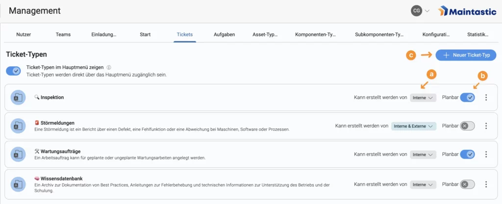
Each ticket type also has a Schedulable setting. This allows administrators and ticket managers to define whether scheduling can be used for that ticket type. The setting is configured in the Management Panel and controls the visibility and behavior of scheduling‑related functions in the system.
When creating a ticket, the Start Date and Due Date fields are only shown if the selected ticket type has been defined as schedulable. Users may optionally enter a start date and a due date. However, both fields must be used together.
Figure 102: Creating and editing ticket types (a. Selecting which users may use the ticket types; b. Creating schedulable ticket types; c. Creating new ticket types)
When clicking on New Ticket Type, a window appears where you can enter the name and a description for the new ticket type. In the next step, you can select various detail fields that should be displayed on the ticket. There are several types of detail fields, such as (short) text, numbers, dates, or multi‑select fields.
Figure 103: Name and description of the new ticket type (1. Create a new name; 2. Create a description)
Figure 104: Selecting the ticket details
After a ticket type is created, it can also be edited in the management tab (see Figure 105). Default detail fields are fields that are part of every ticket type and can therefore not be edited. Custom detail fields are the fields that can be added or deleted. On the right side you can see all the fields that are available and can be added to the ticket type. You can also create custom fields yourself. For that, you must choose a field type and give the field a name and a description (see Figure 106). Ticket types can also be given default values for specific detail fields. This can be useful if certain ticket types are used a lot of times and most details do not change. To set a default value, click on the “set default value” button. A preview page of a ticket opens and you can set the default values as you like.
Figure 105: Editing ticket types (a. Default detail fields; b. Custom ticket details; c. Creating custom detail fields; d. Setting default values for ticket details)
Figure 106: Editing and creating detail fields (1. Selecting a field type; 2. Description of the field)

8.4 Platform configuration and statistics

8.4.1 Configuration

In the ‘Configurations’ tab administrators can configure some of the functionalities of the calls within the entire platform: They can decide whether users are allowed to create video recordings of the calls and if they should start the calls with camera enabled or disabled (see Figure 107).
Figure 107: ‘Configurations‘ tab for setting video recording and camera features for the entire platform

8.4.2 Statistics

In the ‘Statistics’ tab managers can download the call statistics of the last day, week, month or a user-defined period as a cvs-file. They can also check on the storage statistics to find out what percentage of the server storage is being used (see Figure 108). While the storage statistics are always visible, the call statistics will only be activated after a request via Maintastic.

Figure 108: ‘Statistics‘ tab to check the storage statistics and the call statistics

8.5 Profile settings

You can change your own profile settings via the “Settings” area. There you can change your name and username, your email and phone numbers.
Figure 109: Profile settings

9 Home View

9.1 Overview and Navigation

The Home View is the first screen after logging in and serves as the central entry point to the application. It consists of various tiles, each of which provides quick access to different modules and filtered lists.

Figure 110: Home View Overview

9.1.1 Home View Cards

The tiles feature blue counters (pills) that display the number of items in that view. For example, the ‘My open tickets’ tile shows the number of tickets that are open, in progress, and assigned to the user. The counter for ‘My open tasks’ provides information about the user’s own tasks that have not yet been completed. The ‘My requests’ tile opens an overview of all tickets created by the user. In the list view, a filter is active by default, which ensures that only requests created by the current account are displayed. To ensure a clear structure, the list is sorted by ‘Created on’ so that the most recent appear at the top. In addition to the list modules, there are also tiles that navigate to the module without activated filters or sorting, such as ‘My chats’, ‘My assets’, or ‘My video calls’.

9.1.2 Home View Buttons

There are also three buttons with different functions. The ‘Scan QR code’ button can be used to scan all QR codes generated in Maintastic. When a valid QR code is scanned and the necessary permissions are in place, the corresponding element opens. In addition, the ‘Start call’ button can be used to start a call directly. Internal users can select both internal and external contacts from the contact list, while external users can only add internal contacts from their contact list. Once the call has started and participants have been added, external users cannot add any more. After ending the call, the application automatically returns to the home view. The ‘Create ticket’ button can be used to start the ticket creation process directly.

9.2 Home View Configuration

The configuration of the Home View is a platform-wide setting that can only be changed by administrators in the Home tab of the Management Panel. Changes must be explicitly saved before they become visible to all users. Uniform rules apply to both internal and external user groups, whereby the visibility of individual tiles and buttons always depends on the respective permissions of the user. By default, the tiles ‘My open tickets,’ ‘My open tasks,’ ‘My requests,’ and ‘My video calls’ are activated and visible on the Home View. In the configuration area, these can be deactivated or additional tiles such as ‘My assets,’ ‘My workflows,’ ‘My chats,’ and ‘My contacts’ can be activated for the Home View. Each tile can be shown or hidden. The Home View is designed so that at least one tile or button is always active. The order of the tiles can be changed using drag and drop.

10 Integrations & Connectors

10.1 Partner API

Our flexible API is designed to integrate existing IT systems with Maintastic. Typical use cases range from integrations of Customer Relationship Management (CRM), Enterprise Resource Planning (ERP) and Asset Lifecycle Management (PLM) systems down to the integration of Manufacturing Execution Systems (MES) or other shop floor oriented IT systems.
If you would like to use our Partner API please contact your key account manager at Maintastic or write an email to service@ Maintastic.de. We will activate the Partner API on your workspace and provide you the necessary API key.
Once the Partner API has been activated on your workspace, you can access the documentation via the following link:

10.2 Outlook Add-In

10.2.1 Installing the Outlook Add-In for your company, department or team via Microsoft 365 Admin Center

If you want to Install the Add-In for a whole team or group that you are responsible for, you need to access the Microsoft 365 Admin Center as seen in Figure 111. Now go to “Integrated apps” in the Settings tab. There you can upload the Maintastic Add-In by inserting a link. The link can be found under the following address: https://*companykey*.share-platform.de/shout/v1.0/manifest.xml with your own company key or workspace name (Figure 112). After that, select your entire organization in the next step and finish deployment just like you can see in the following pictures.

Figure 111: Going to your Microsoft Admin Center
Figure 112: Uploading custom apps
Figure 113: Providing the link for the Add-In
Figure 114: Assigning users
Figure 115: Finishing the deployment

10.2.2 Installing the Outlook Add-In via Outlook

If you want to Install the Maintastic Outlook Add-In, make sure that the option to install Add-Ins is activated by your company. After that, go to the Add-In section on your Outlook home page (Figure 116).
Figure 116: Finding add-ins for your MS Outlook
Once you reach the Add-In section, go to “My add-ins” and add a custom add-in via URL (Figure 117). The URL can be seen in Figure 118, only *companykey* must be replaced by your own company key or workspace name.
Figure 117: Adding a custom add-in
Figure 118: Inserting the URL for the Maintastic add-in

10.2.3 Login

After the Maintastic Add-In is successfully installed, log in to your personal Maintastic account. Now you can add Maintastic meetings in Outlook (Figure 119).
Figure 119: Logging in to your Maintastic account and creating a Maintastic meeting in Outlook (1. Maintastic login; 2. Creating a Maintastic meeting)

10.2.4 Create a Maintastic call via Outlook

After choosing to add a Maintastic meeting, the video call information such as the call link will be automatically edited into the appointment (Figure 120).Furthermore, the appointment you created will be shown in your Outlook calendar (Figure 121).
Figure 120: Creating and editing a Maintastic meeting in Outlook (1. Maintastic video call link; 2. Video call QR code)
Figure 121: Maintastic call in the Outlook calendar

11 Maintastic Salesforce Connector

11.1 Getting started

11.1.1 Integrating component into Lightning Record Page

Go to “Setup” in your Salesforce platform and search for “Object Manager” and then within the “Object Manager” for “Ticket” and select this item. In the left-hand menu, click on “Lightning Record Pages”, select your specific page and then click on “Edit”. In the left panel, search for “oculavis_share_salesforce_lwc” as shown in Figure 122. Finally, drag the component to the desired position on your page and save the changes. After placing the component, please enter the URL of your Maintastic platform and the corresponding platform-specific token, which will be provided by us. This will enable the connection between both platforms.
Figure 122: Finding the Salesforce component in the Components menu and placing it in the desired location

11.1.2 Individual user authentication

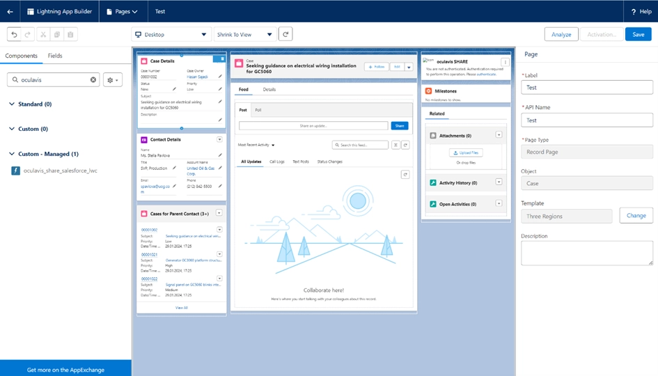
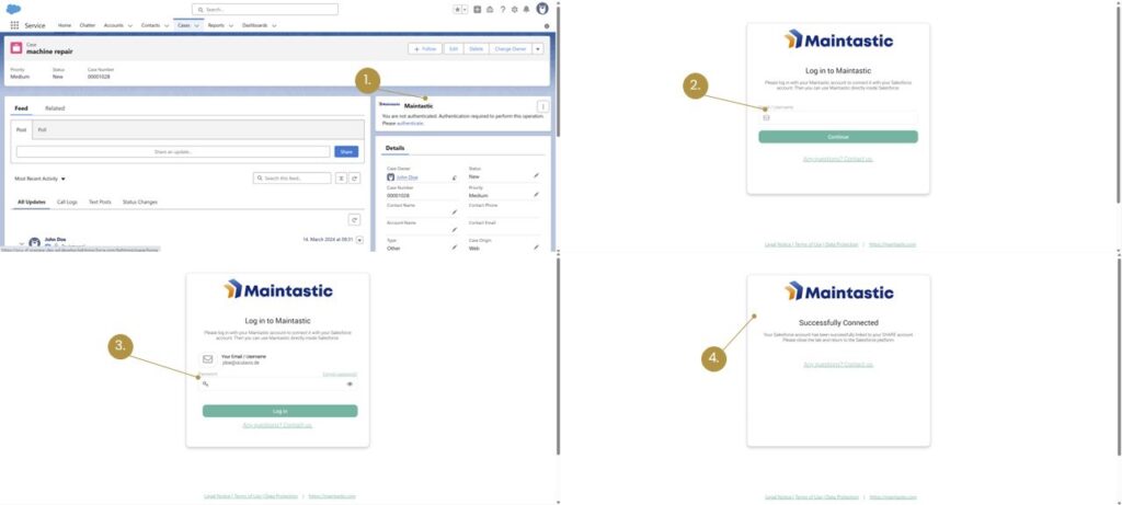
Once the installation is completed and the component has been placed, users can start utilizing it. To proceed, each user must authenticate with their Maintastic account by clicking the “Authenticate” button within Salesforce. This action will open a new browser tab where users will be prompted to log in to their Maintastic platform using their account credentials.
Please make sure to use the same email address in Salesforce and in Maintastic. It is only possible to connect one Maintastic account to one Salesforce account and not to use one Maintastic account with multiple Salesforce accounts.
After successfully logging in, the connection between the platforms will be confirmed. Users will then be redirected back to Salesforce, where the component will be fully integrated and operational. For visual reference, this process is also illustrated in Figure 123.
Figure 123: Authentication in Maintastic (1. click on "authenticate" in the Maintastic component in Salesforce; 2. and 3. log in to Maintastic in the new tab; 4. authentication successful)

11.1.3 Overview Workspace

The workspace can be extended by many components in Salesforce. The workspace of the Maintastic component, which can also be seen in Figure 124, consists of the main menu navigation, in which you have the option of scheduling or starting calls, opening an Maintastic ticket or adding or disconnecting an Maintastic ticket via the three dots.
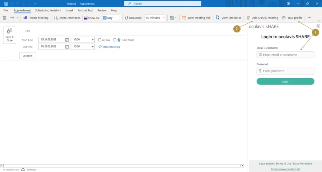
Below the Main Navigation are four areas in which calls are listed. They start with the active calls, followed by the upcoming calls and finally the future and past calls. Each of these areas displays information such as participants or the respective call times and, depending on the area, allows a call to be started immediately or reopened if it is not already an active call.
124: Classification of the workspace

11.2 Videocall

11.2.1 Plan Videocall

To schedule a video call via the Maintastic component in Salesforce, click on the “Plan video call” button within the ticket in the Maintastic window. The user interface of the Maintastic component in Salesforce is shown in Figure 125.
Figure 125: User interface of the Maintastic component in Salesforce (a. Maintastic component; b. "Plan video call" button)
A window opens in which you can now create a new video call, for which you have two options. You can now create a direct call or schedule a call. To schedule a call, please select “Schedule call”. You can now select a start and end date as well as a start and end time and add participants to the call. To add participants, please enter their email address or their Salesforce or Maintastic user name. When you have configured the video call according to your wishes, click on “Send”, the process is shown again in Figure 126.
Figure 126: Schedule a video call (1. Specify the name of the video call; 2. Specify the start and end date; 3. Specify the start and end time; 4. Enter the contact details of the participants of your call)
Once you have scheduled your video call, it will be displayed in the user interface of the Maintastic component (see Figure 127). You can now see the name, the time and the added participants. The link to the call is also provided here and you have the option of editing the call, deleting it or starting it directly.
Figure 127: Scheduled call in component (a. Copy call link; b. Edit call; c. Delete call; d. Start call directly)
After the call has been created, an e-mail is automatically sent to all added participants containing the join link and an appointment prompt, which can be added directly to the calendar.

11.2.2 Direct Videocall

To create a direct call via the Maintastic component in Salesforce, click on the “Schedule video call” button (see Figure 126). A window will open in which you must select “direct call” in order to create a direct call. You can then name the call and add participants by email address or with their Maintastic or Salesforce username. After these steps, it is then possible to start the call directly via the “Start call” button, as shown in Figure 128, whereupon you will be forwarded directly to Maintastic.
Figure 128: Create a direct video call (1. Define the name of the call; 2. Select the immediate call; 3. Add participants; 4. Start call)

11.3 Ticket

11.3.1 Link Ticket

To link a ticket from Maintastic, click on the three dots in the Maintastic component in Salesforce. The option “Link Maintastic Ticket” will be displayed (see Figure 129).
Figure 129: Submenu for linking the ticket
As soon as you have clicked on the option to link the ticket, a window opens in which you can select the ticket you want to link and then link it, the procedure is shown in Figure 130 gezeigt.
Figure 130: Window for linking the ticket (a. Search bar for ticket names or IDs; b. Selection menu for tickets; c. Button for linking)

11.3.2 Unlink Ticket

To unlink an Maintastic ticket, click on the three dots of the Maintastic component in Salesforce and select the option “Unlink ticket” (see Figure 131).
Figure 131: Submenu to unlink a Ticket
A window opens in which you can click on “OK” to unlink the ticket (see Figure 132).
Figure 132: Confirm ticket unlinking

11.3.3 Ticket Features

If you change the status of your ticket in Salesforce, the status is automatically applied to the linked ticket in Maintastic, as shown in Figure 133 and Figure 134.
Figure 133: Change ticket status in Salesforce
Figure 134: Automatically transferred ticket status in Maintastic
If you would like to use our Partner API, please contact your Key Account Manager at Maintastic or send an email to service@maintastic.com. We will activate the Partner API on your workspace and provide you with the necessary API key.
@media print { /* Störende Bereiche ausblenden */ #wpadminbar, .site-header, .elementor-location-header, header, footer, .print-hide, .elementor-widget-theme-post-title, .elementor-widget-site-title, .elementor-widget-theme-site-tagline { display: none !important; } /* Abstand über h2/h3 */ h2, h3 { margin-top: 10px !important; } /* Verhindert Seitenumbruch mitten in Bildgruppen oder Figuren */ .no-break, figure, figcaption, .elementor-widget-image, .elementor-widget-text-editor, .elementor-widget-heading { page-break-inside: avoid !important; break-inside: avoid !important; } /* Optional: Bildabstände optimieren */ .elementor-widget-image { margin-top: 10px !important; margin-bottom: 10px !important; } /* Druckränder */ @page { margin: 20mm; } html, body { margin: 0 !important; padding: 0 !important; } }